How might I present modern day stories through a historical lens in a quarterly published magazine about the American South?
PROBLEM
Our collective history and cultural past shape us in more ways than most realize. A lot of history can seem dry and academic—locked away in textbooks, lecture halls—inaccessible to large swaths of the population. So, I asked myself how I might be able to present modern-day stories through a historical lens in a quarterly published magazine about the American South.
SOLUTION
• Increase awareness of historical complexities and display how they affect modern-day thoughts, attitudes, and beliefs.
• Design a magazine that appeals to the newsstand buyer and subscriber alike
• Curate stories and images that fit within the magazine’s mission while speaking to readers.
• Create loyal subscribers
Duration 20 weeks
Category Layout Design
Role Layout, Branding, Article and Photo Curation
Partner Solo Project
Tools InDesign, Photoshop, Illustrator
______________________________________________________________
PROCESS
Background
I love reading and can attribute this passion to my mom and also my papa, who I would see devour books on history. This past summer, I was brainstorming ideas for the magazine I would design for the first quarter of my second year in design school. During my week-long trip back home to Tennessee, this past summer, I found myself jet-lagged and wide-awake at 2 AM. But, it is in these moments where most good ideas begin. I wanted to design a magazine about the South. Primarily inspired by some of the past and current books I was reading, I began to transcribe some of my favorite stories from authors such as Tony Horwitz, Dennis Covington, and Paul Theroux.
Branding
Over the summer, I continued collecting stories and images that I wanted in my magazine and then developed a mood board and personas and began working endlessly on a word mark. My initial sketches were illustrative and expressive which seemed to not fit in with the magazine’s quieter tone. So, I decided to stick with a typeface that was more constrained, yet elegant and classy—Mrs. Eaves.

Personas

James — 25 years old
Columbia, South Carolina
James grew up in the suburbs of Columbia, South Carolina, and received a B.A. at Furman University. James is spontaneous and enjoys itinerary-less road trips, which seem to lead him to the most unusual places while meeting and getting to know unforgettable characters. He enjoys reading and learning, but his minimalist approach to life, and lack of regular income, leaves him with very few personal possessions. He enjoys browsing new books at the library and the magazine section at the newsstand and occasionally picks up a copy of something that piques his interest. He has a keen interest in psychology, modern culture, and human behavior. When he’s home, he sleeps in his parent’s spare bedroom.
Marsha — 34 years old
Champaign, Illinois
Marsha received a B.A. from Yale University and a Ph.D. in from Rutgers University studying history. Now, she focuses her research on United States Political History at the University of Illinois. As a child, she would regularly visit family down in Neshoba County, Mississippi, where she began taking a keen interest in her family’s history of life in the South and their eventual migration to Chicago. While well versed in history, she is continually researching and interested in gaining new perspectives on the past and how it shapes modern-culture.
Marjarie — 68 years old
Prince George’s County, Maryland
Marjarie grew up in Prince George’s County in Maryland went to the University of Maryland as a Sociology & Education major. She is the mother of 4-grown children, a home-maker, and a substitute teacher who enjoys volunteer work as a docent at various historical landmarks around southern Maryland — most notably the Surratt House. She enjoys traveling and music, including classical and the Rolling Stones and Led Zepplin. She has grandchildren and continues to be very active.
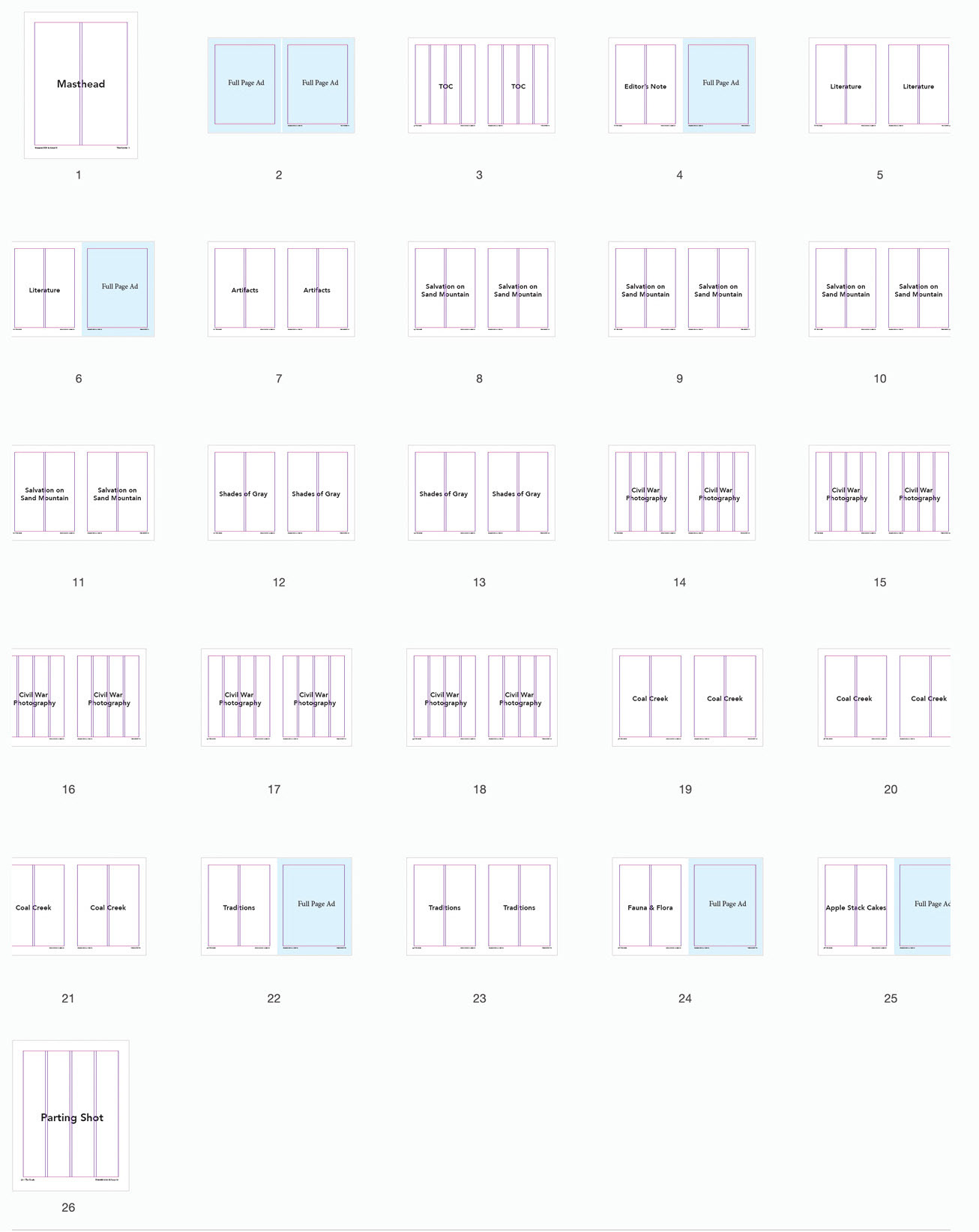
Flatplan
I chose Adobe Garamond (9.5/12) as my body copy as it was quiet in tone and readable — allowing the reader to track from one line to the next without having the text fall apart. I then set up a baseline and modular grid — which allowed me to calculate the character count of each article, giving me an estimate of the number of pages I’d need to build out. I then began flowing in copy for each article and placed boxes where I thought photos would be and then began designing the opening spreads. Each week, I would spend 5-6 hours tweaking my magazine and would then bring my progress back to class to critique.
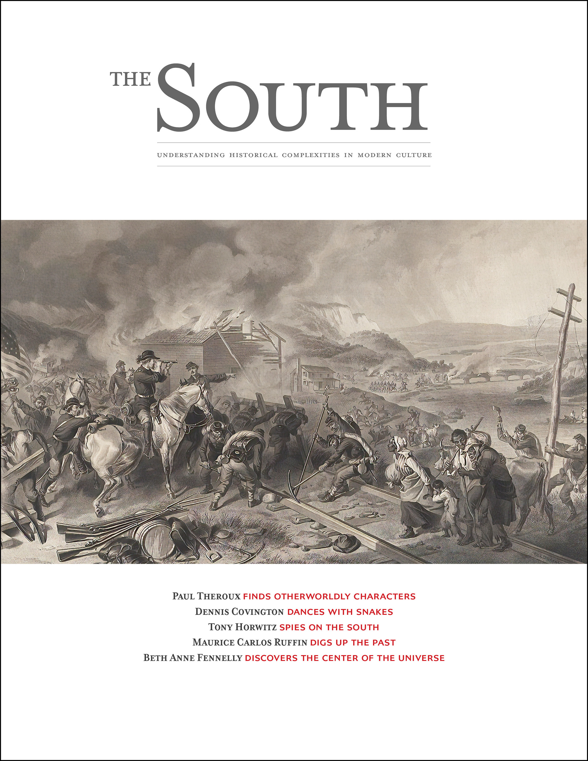
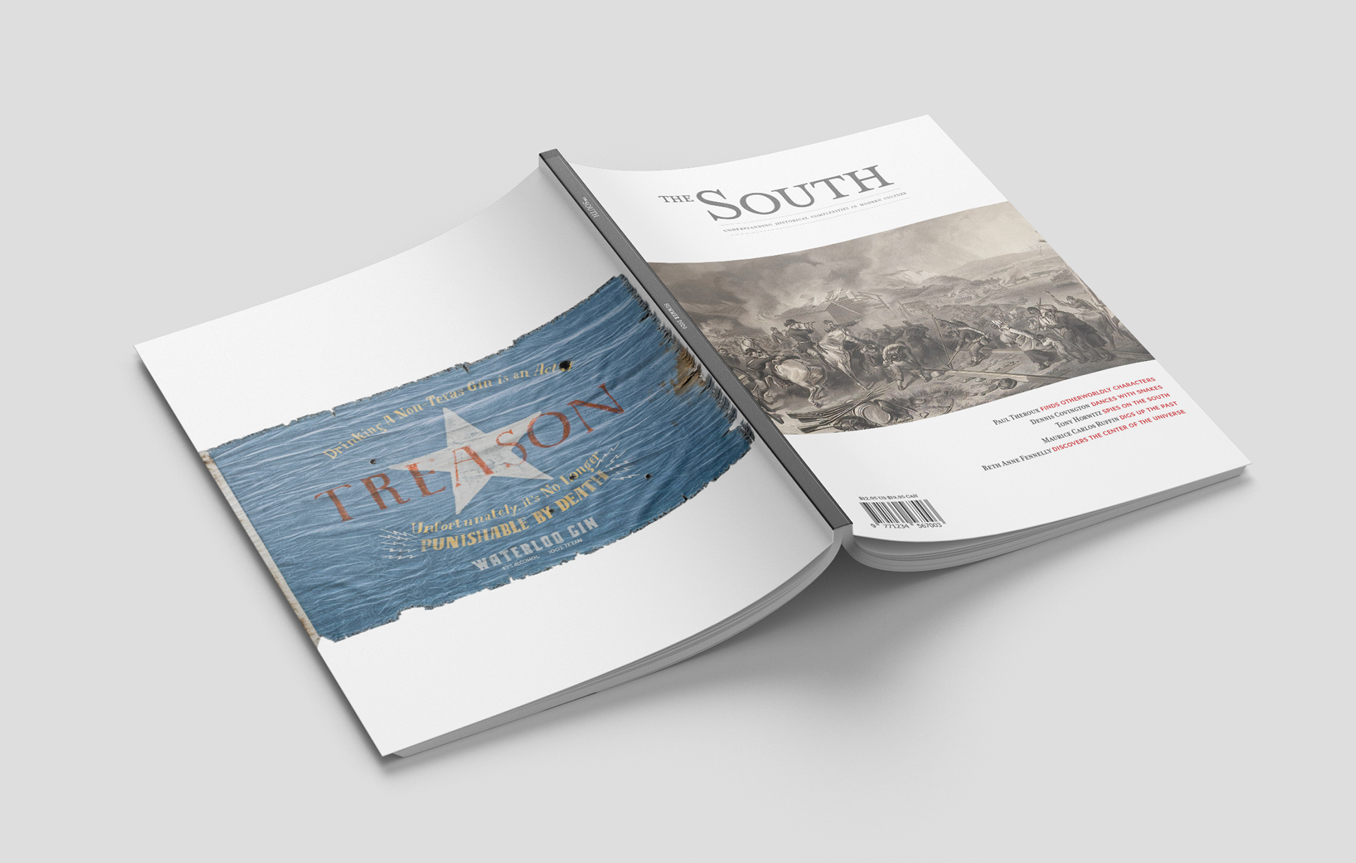
Cover
Although there was no particular theme for my first issue, I wanted to feature an image that tied to one of my stories but was also spoke to the South as a whole. One of the feature well articles is a story by Tony Horwitz titled “Shades of Gray,” which covers the Confederate flag debate on South Carolina’s Capitol grounds.The article traces the feelings of white, southern, Confederate flag supporters back to the U.S. General William Tecumseh Sherman’s infamous March to the Sea Campaign where the military goal was to beat the South back into the Union and destroy anything that was in the army’s way — leaving behind a “40 mile-wide” trail of burned homes, destroyed crops, and a deep and lasting hatred of the Union and continued support for the Confederacy 156 years later. Alexander Hay Ritchie’s brilliant mezzotint depicts this scene with stunning clarity. Sherman is seen on his horse as his men destroy rail lines and tear down telegraph poles, all while Savannah burns to the ground.
Table of Contents
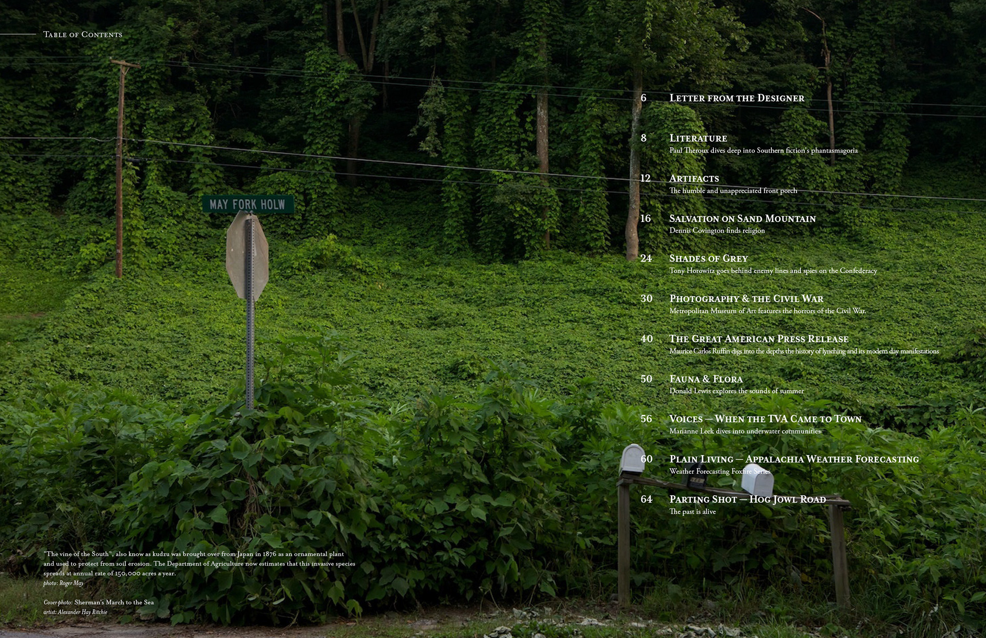
Brought over from Japan in 1876, Kudzu was used as an ornamental plant that also protected hillsides from erosion. The Department of Agriculture now estimates that this plant spreads at a rate of 150,000 acres a year. This particular image from Roger May speaks to me because I’ve seen this same scene a million times over in every corner of the South. It’s familiarity instantly creates a connection with the reader while creating a lovely backdrop and high contrast for the white copy.
Front of Book
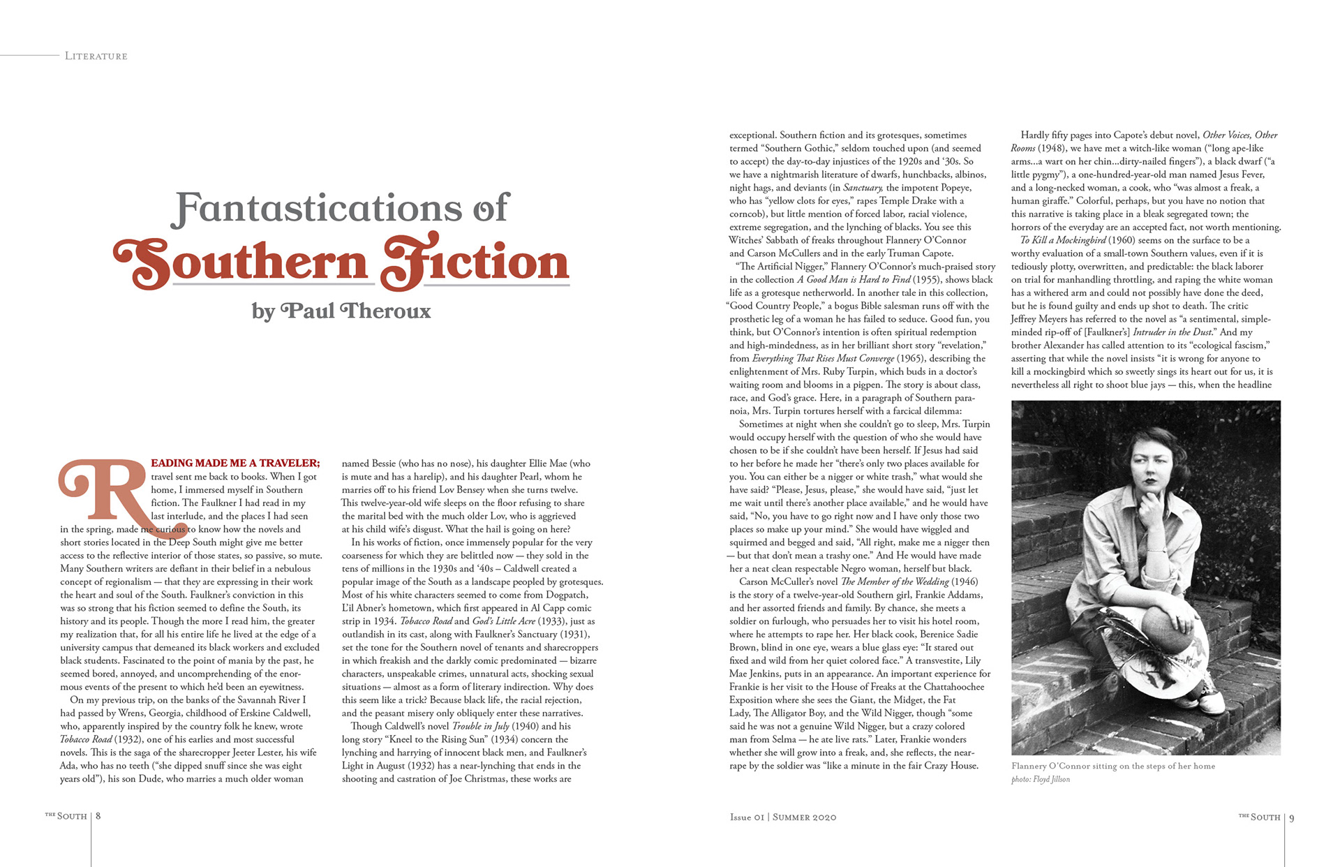
Personally, Southern literature is what drew me back to the South. It turned what I always thought of my mundane surroundings into vivid clarity and context while attempting to explain the intricacies of the human condition. Each publication of The South will feature a front-of-book article on Southern Literature. In this inaugural, Paul Theroux writes about the genre of Southern Gothic and how the “grotesque” characters from writers such as Carson McCullers, Flannery O’Connor, and Erskine Caldwell are used to help illuminate the inequality and injustices that are so interwoven into Southern culture. I wanted to create an opening spread that felt quieter in tone but also felt fairytale-like and dark. This was accomplished by using the typeface Bookmania in the headline and byline and a photo Flannery O’Connor deep in thought with dark, moody shadows in the background.
Featurewell
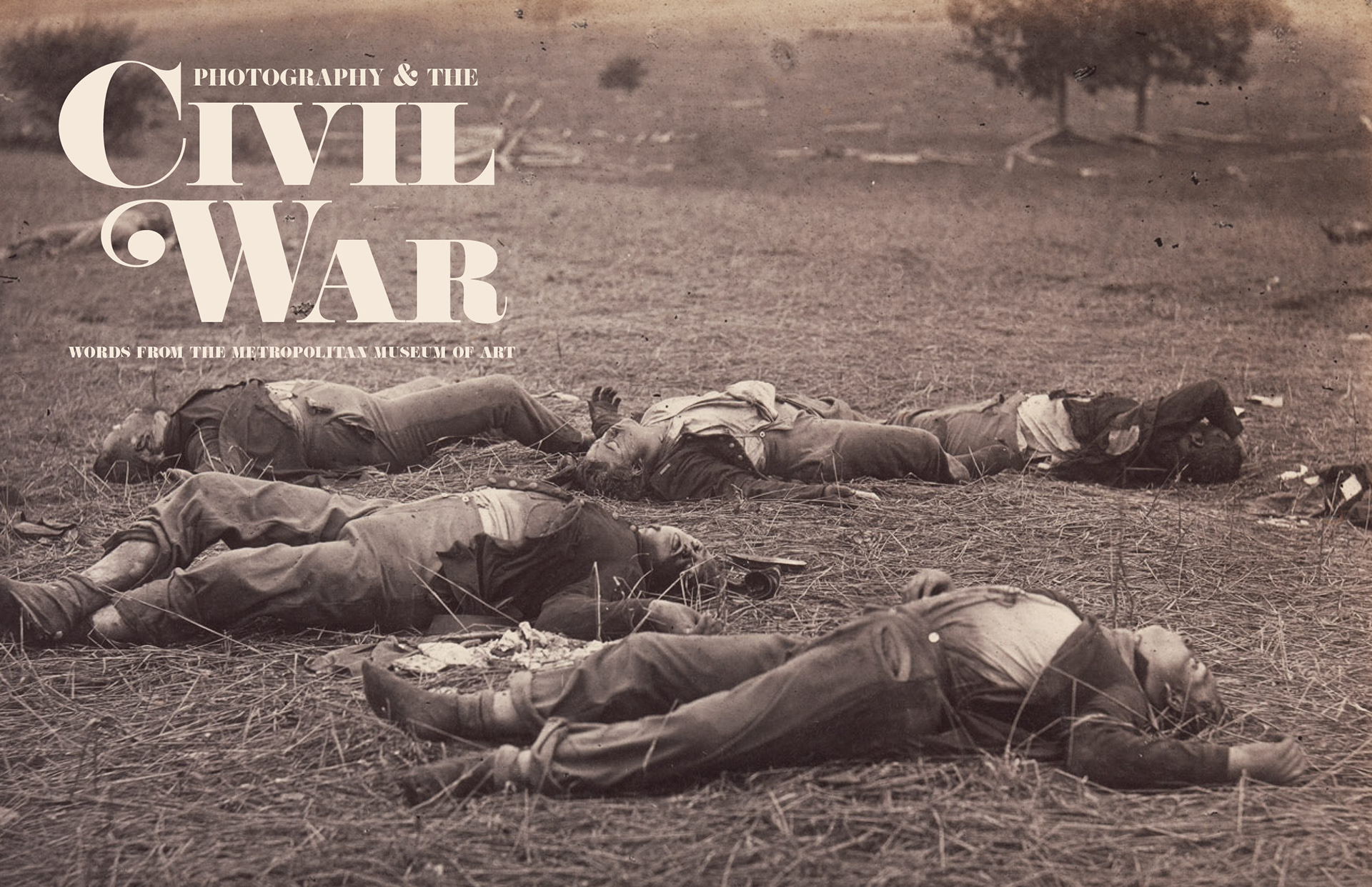
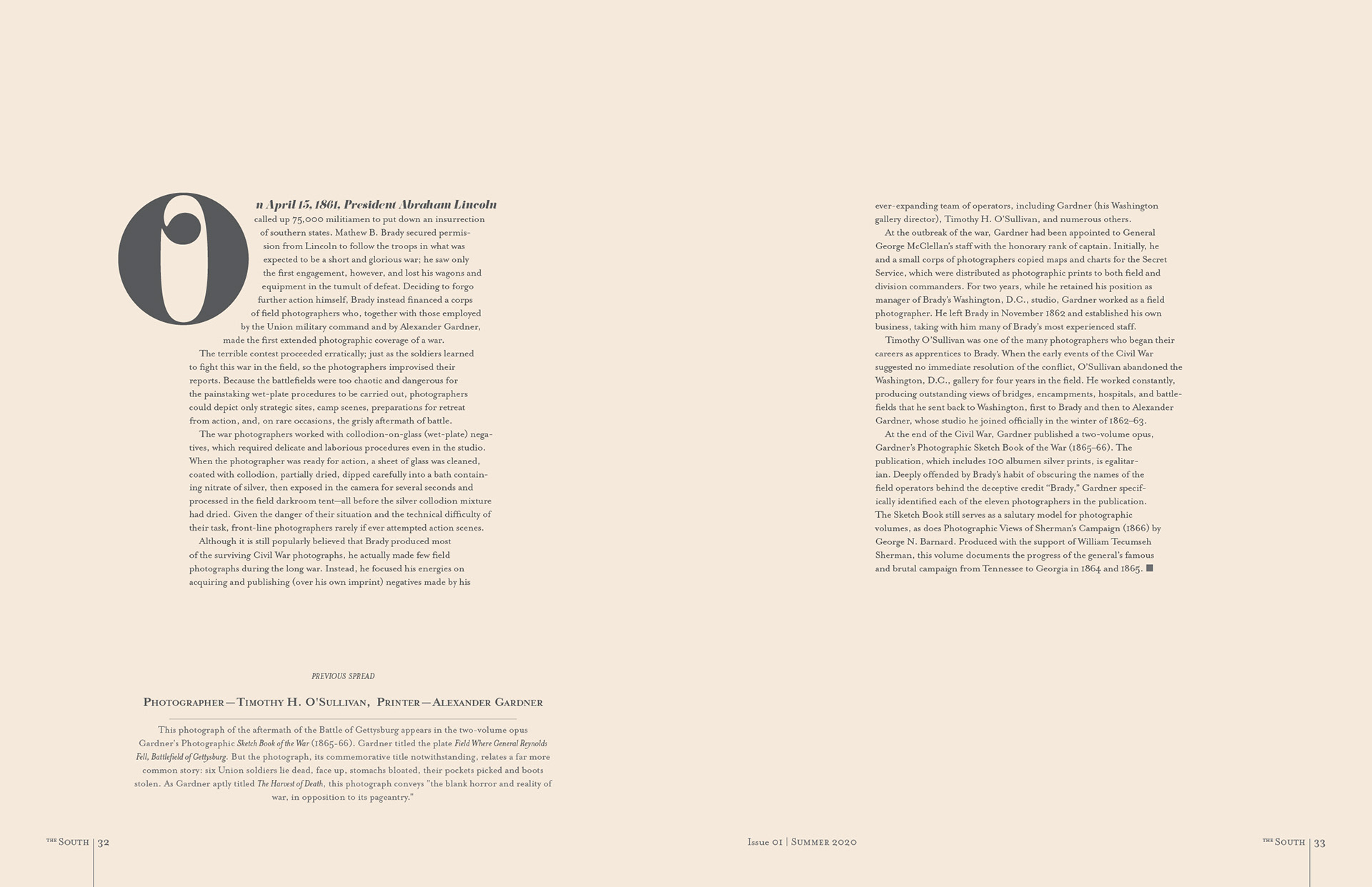
One of my featurewell stories is a photo essay showcasing Civil War photography. The short story in this article is about how photography influenced the public’s perception of the war. I wanted to design an opening spread that was dramatic and impactful. I took a color dropper from this image to create a colored background that is found in the headline as well as the background throughout the entire article. Personally, this photo by Timothy O’Sullivan is hard to look at. It features “Six Union soldiers lie dead, face-up, stomachs bloated, their pockets picked and boots stolen. As Gardner aptly titled The Harvest of Death, this photograph conveys “the blank horror and reality of war, in opposition to its pageantry.”
Back of Book
In the summer, the air is always weighted with a dense humid texture and filled with a beautiful chorus of katydids, peppers, bullfrogs, and cicadas. These sounds had always been a part of my life, and I didn’t even know they were there until I moved to Seattle. In every issue, there will be a back-of-book section on the South’s fauna and flora.
______________________________________________________________
SUMMARY & NEXT STEPS
My love for print turned this magazine into a passion project. It was indeed a joy, and I spent every spare moment I had designing it. My goal was to present modern-day stories through a historical lens and did this by designing a quarterly published, literally magazine that was timeless, candid, honest, and accessible. This was accomplished by creating a cohesive mood and design throughout with less-expressive FOB and BOB spreads and more expressive spreads for the featurewell articles. Now that the magazine has a solid flatplan and foundation, I would like to expand it into three additional issues.