How might I create a cohesive advertising campaign that combines musical elements and zoo animals that feels like summer and appeals to children and adults?
PROBLEM
Zoo Tunes is a 37 year old annual festival that takes place at the Woodland Park Zoo. It’s an event that targets both kids and adults and helps raise money for the zoo’s mission that “Saves wildlife and inspires everyone to make conservation a priority in their lives.” This annual event is fun for the whole family with targeted demographic ranging from children ages 6-14 years old and adults ranging from 30-60 years old.
SOLUTION
• Grab the attention of potential concert-goers through various advertising channels
• Blend musical and zoo animal elements through a unique and fun illustration that transcends various media platforms as well as other concert assets
• Bring families together for a fun summer concert series while raising money for the Woodland Park Zoo
Scope 8 Weeks
Category Branding, Layout Design, Illustration
Tools Indesign, Illustrator, Photoshop
______________________________________________________________
PROCESS
Visual Research
Being a family friendly concert series I wanted to create a poster that connected with children as well as adults. I achieved this goal by using a saturated color palette, expressive typography, and a playful illustration style.
The first step in my visual research process was to look at posters and marketing materials from past Zoo Tunes events. I then began collecting posters from other types of concerts and kid-friendly events. My next step was to create a list of animals that are at the Woodland Park Zoo as well as a list of instruments that may be played at the concert series. I then began brainstorming some of my ideas by sketching and then took some of these thoughts into Adobe Illustrator — the tool I used throughout the entirety of my design.
"Create a poster that connected with children
as well as adults."
as well as adults."
Visual Solution
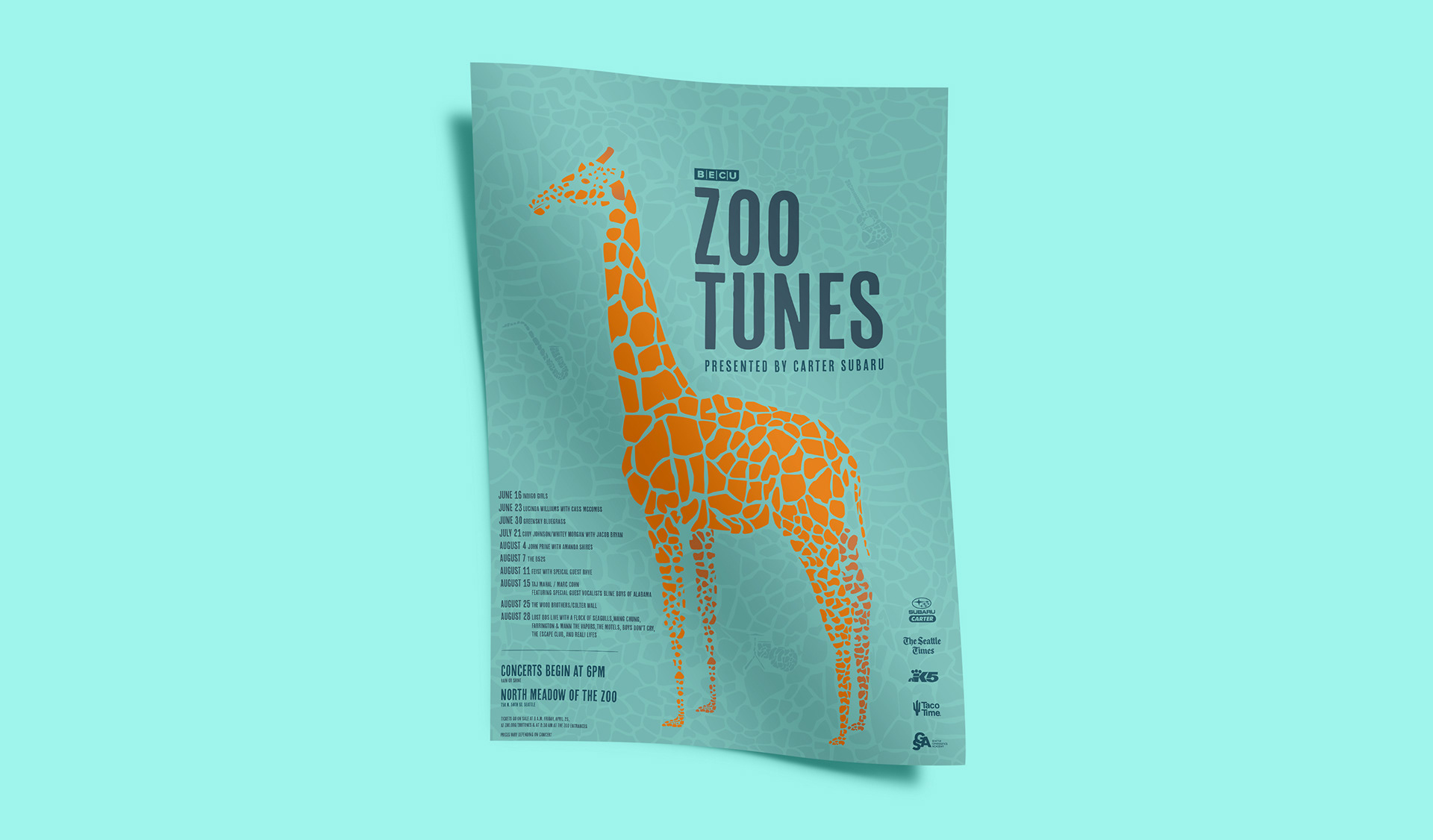
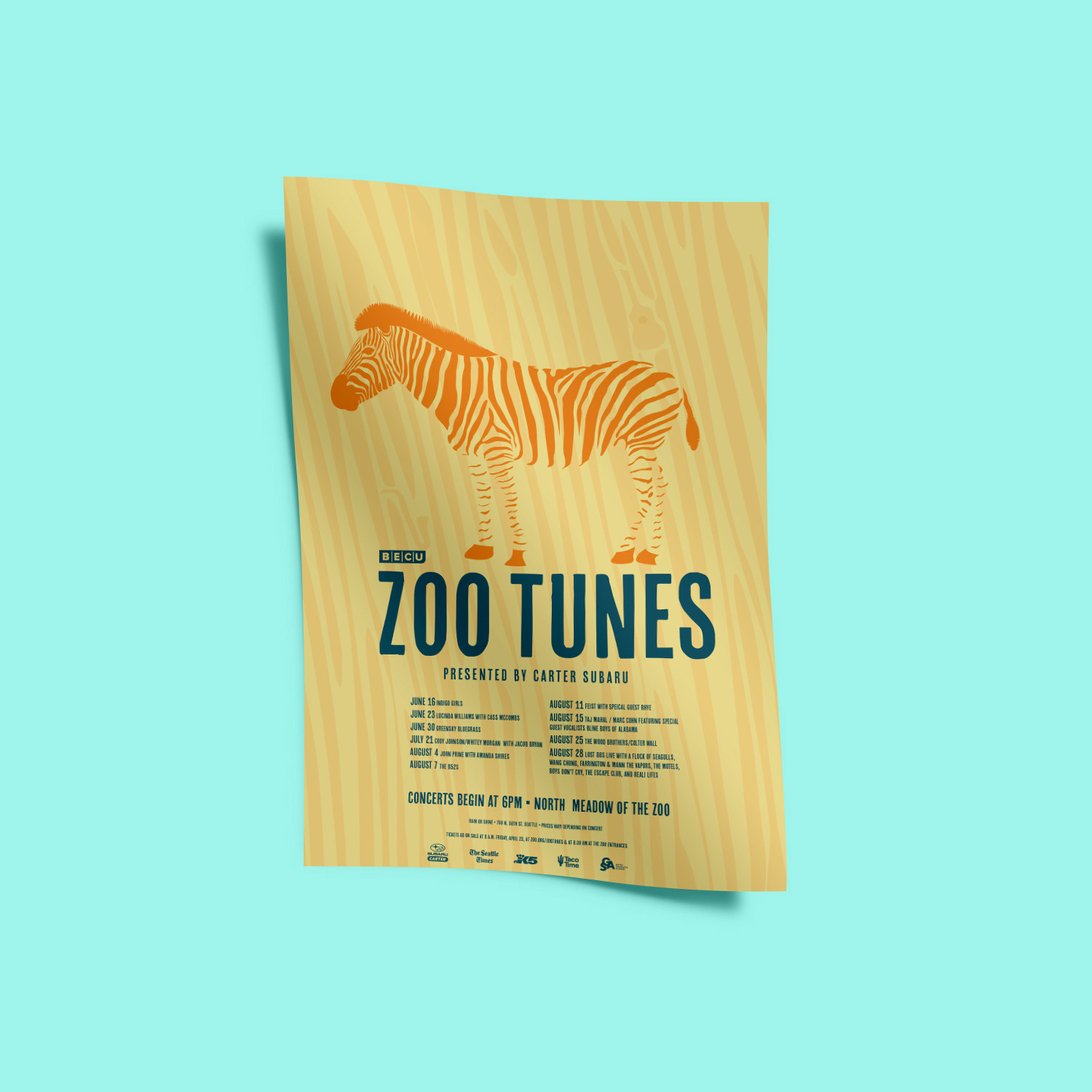
Posters
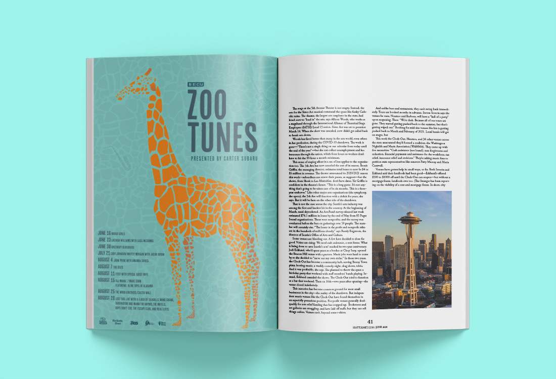
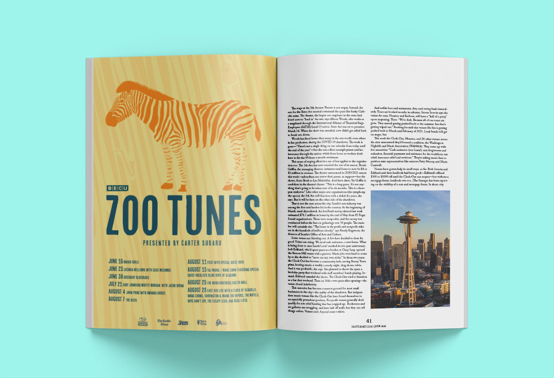
I’ve always thought giraffes were unique and beautiful animals so I began drawing one. After creating an outline I began illustrating the spots and then eliminated the outline and realized that I didn’t need the outline of the body at all — relying upon the gestalt principle of closure. I then took the same giraffe pattern and recreated it as a background pattern throughout the poster. The giraffe would only stand out from its background by its color contrast. From my visual research I placed some other posters on my moodboard and pulled the color palette directly from one of them with a few alterations. I felt like the colors I chose were fun and playful and easy to see and read from a distance. I pulled a similar typeface from a jazz concert poster for the typography. I initially started with a typeface that was more expressive in tone but decided to scale it back as the illustration style became more expressive.
I let the visuals be the driving force of my composition. I started with illustrating the giraffe and then began on the typography. Initially I kept the type layered on top of the giraffe but through my critique groups, was offered the suggestion that I let the fun giraffe stand alone and work the typography around it. This allows for the type to be more readable and gives the giraffe the opportunity to make an appearance on other types of event collateral such as t-shirts, ticket stubs, and tote bags. The visuals are fun and playful and have a bunch of hidden elements throughout. While this poster communicates the basic information of the event the playful illustration and saturated color palette will grab someone’s attention and hold it, all while making an aesthetic contribution to the space.
"...the playful illustration and saturated color palette will grab someone's attention and hold it, while making an aesthetic contribution to the space"
Print Ad
Similar to the posters above, the print ad needed to grab the viewer's attention and hold it while making an aesthetic contribution to the magazine. Here, I kept the similar layout of the poster but condensed some of the information.
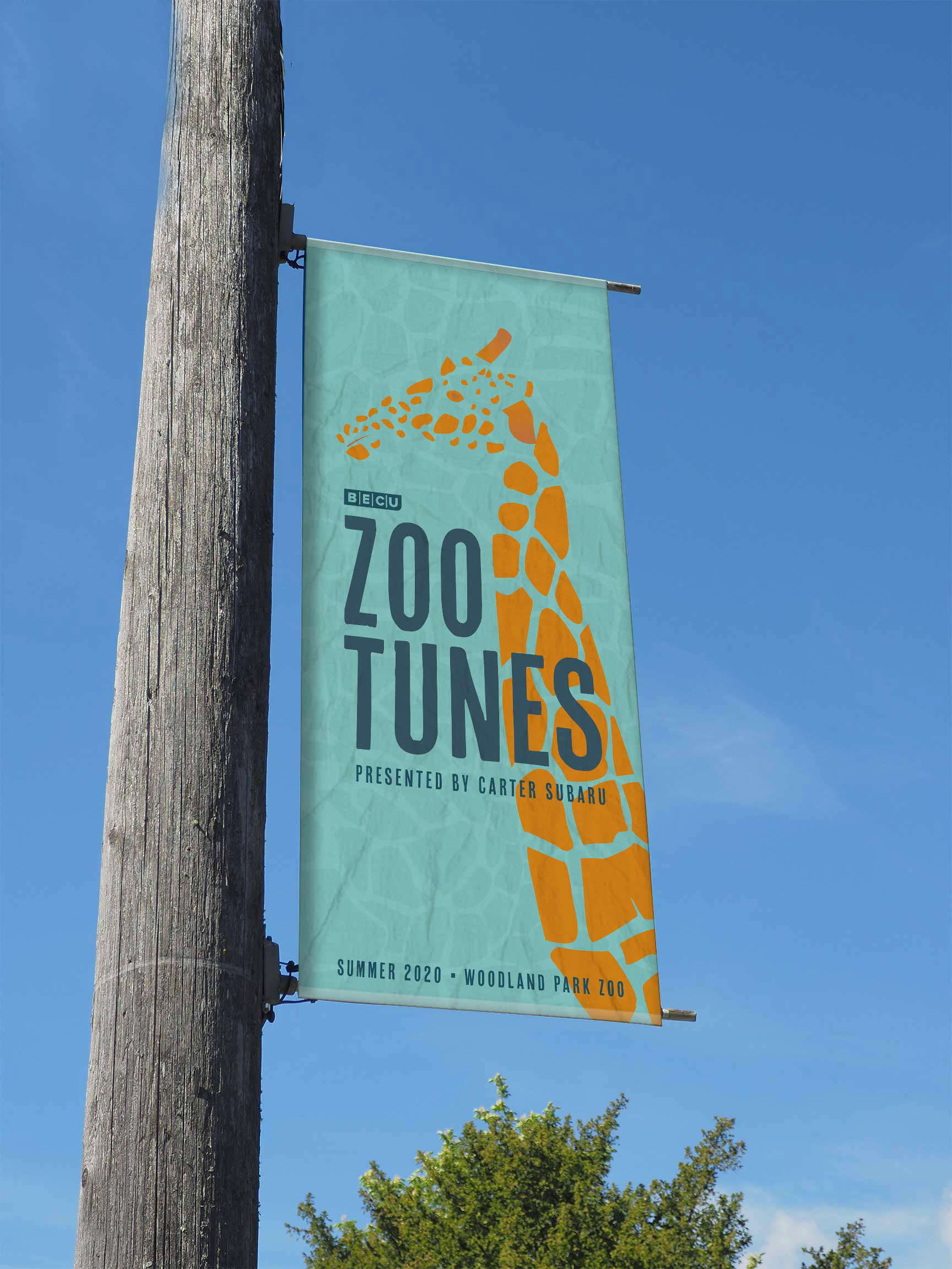
OOH Ad
There are a number of these banners on wood telephone poles lining Greenwood Ave. — the street that feeds into Woodland Park Zoo. While on a sunny afternoon bike ride I took a moment to take a photo of one of these banners and built my design in Illustrator to fit. The visual language needed to be the same as the other assets but the information needed to be abbreviated and readable to pedestrians, cyclists, and motorists.
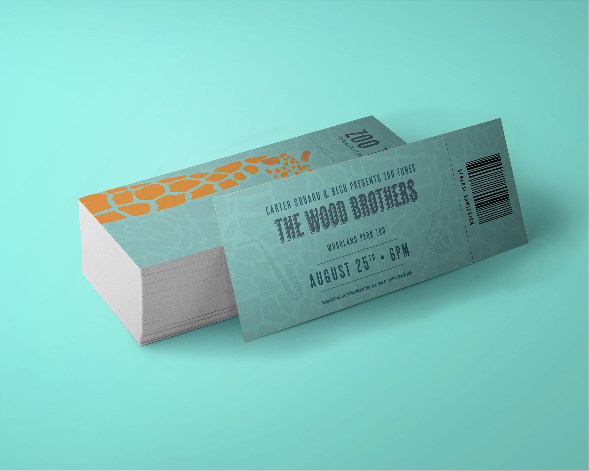
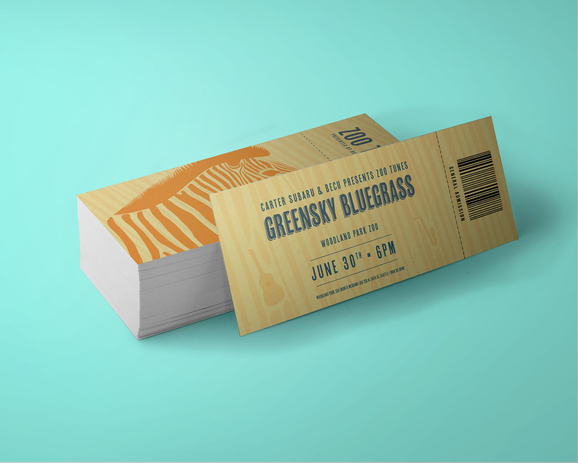
Tickets
Printed tickets are not only away to get into a show but are often kept as souvenir items used as keepsakes for book marks, journals, and scrap books. I took the animals and made them bleed off the document and continued to incorporate the instruments into the background pattern.
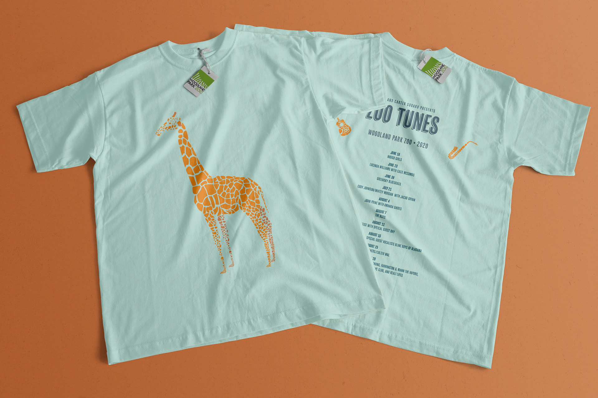
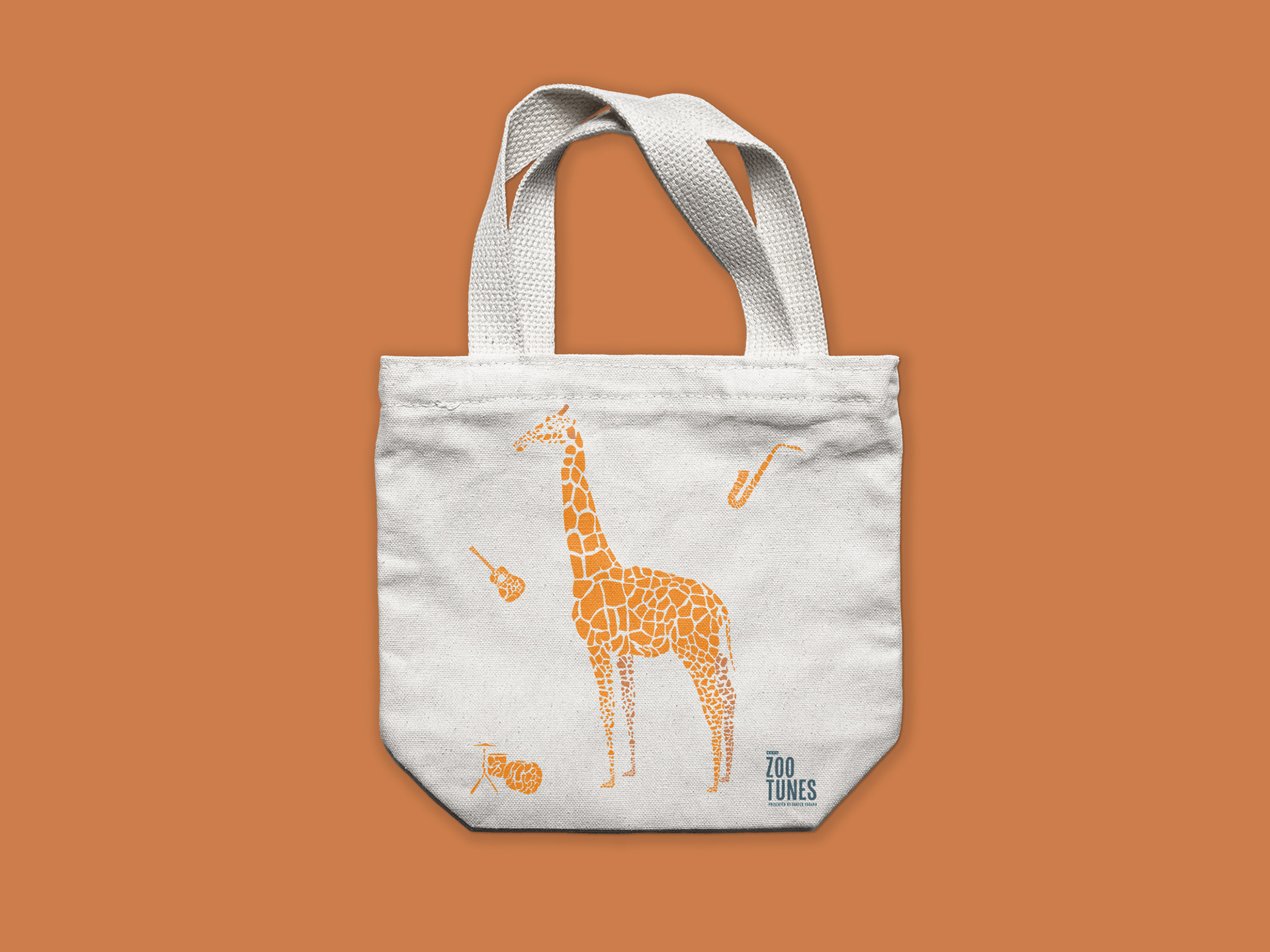
Tote & Tee
Consumers are less willing to wear things with big logos that overly promote the brand. At the same time the t-shirt needed to commemorate the bands that played while reminding the concert-goer the fun time they had at the show while promoting the event. I wanted to create something that I would be willing to wear. So, I took the animal design and centered it on the front and placed the Zoo Tunes title on the back with a list of dates and bands that played. I then took the animal and instruments, placed them on the canvas tote and placed the vertical lockup of the word mark in the lower right corner.
Social
Consumers are less willing to wear things with big logos that overly promote the brand. At the same time the t-shirt needed to commemorate the bands that played while reminding the concert-goer the fun time they had at the show while promoting the event. I wanted to create something that I would be willing to wear. So, I took the animal design and centered it on the front and placed the Zoo Tunes title on the back with a list of dates and bands that played. I then took the animal and instruments, placed them on the canvas tote and placed the vertical lockup of the word mark in the lower right corner.
______________________________________________________________
CONCLUSION
When I entered this project I lacked direction and felt completely overwhelmed which makes this project all the more special to me. I leaned heavily on the design process which got me off the ground and to the finish line. Once I came up with and executed my concept successfully it was really fun to expand that idea to another zoo animal and into other forms of media.
If I were to continue on this project I think I would like to come up with additional ways to incorporate more motion or play with additional animal patterns and build out the deliverables.
If I were to continue on this project I think I would like to come up with additional ways to incorporate more motion or play with additional animal patterns and build out the deliverables.