How might I design a 16oz can, 4-pack carrier, and coaster design for a limited release cider that captures the feeling of summer and flavor of honey peach?
PROBLEM
Create a unique and cohesive packaging design for Seattle Cider Company’s limited release Honey Peach cider that appeals to their demographic, captures the feeling of the flavor of honey peach, feels like summer, and stands out on the shelf from other competitors.
SOLUTION
• Create a unique design that stands out on the shelf from other competitors but works within Seattle Cider Company’s brand guidelines — still making it recognizable to current and familiar customers.
• Create a design that feels like summer and the outdoors and tastes like honey peach
• Create a design that works across three mediums: 16oz can, 4-pack carrier, and coaster.
Timeline 5 weeks
Category Packaging System and Layout Design
Tools Illustrator, InDesign, Photoshop
______________________________________________________________
PROCESS
Tastes Like Summer
The goal is to create a unique and cohesive packaging design for Seattle Cider Company’s limited release Honey Peach cider that appeals to their demographic, captures the flavor of honey peach, tastes like summer, and stands out on the shelf from other competitors.
"flavor of honey peach and tastes like summer..."
"first cidery in Seattle since prohibition..."
Background
Seattle Cider Company is the first cidery in Seattle since prohibition. Their mission is to bridge the gap between beer and cider and provide a good option for those who have gluten sensitivities. Their critical demographic are professionals who live in the Pacific Northwest and are the mid-20s-40s and care about the environment and the outdoors.
Research
Seattle Cider Co. is focusing on producing well-balanced cider where the residual sugar doesn’t overpower the other flavors. They provide year-round ciders, which include Dry, Semi-Sweet, Tangerine Turmeric, Berry Rose, and Basil-Mint. They also release a limited amount of seasonal ciders, which include Pumpkin Spice, Oaked Maple, Gin Botanical, and Pineapple Agave. They provide a unique and wide variety of ciders, but there isn’t much design difference between their year-round and limited release ciders.
After my initial research, I began to put together a mood board and evaluated the trends around beer and cider designs. I also wanted to see what gets my attention when I’m in the grocery store, trying to find something to drink. Consumers are naturally drawn to brands that are familiar to them. It’s a safe bet to just stick with what you know but the only way to evaluate what something might taste like is by judging the book by its cover. There appears to be a growing trend in the beverage industry using bright, saturated colors with pattern-driven designs.

Seasonal — photo: Seattle Cider Company
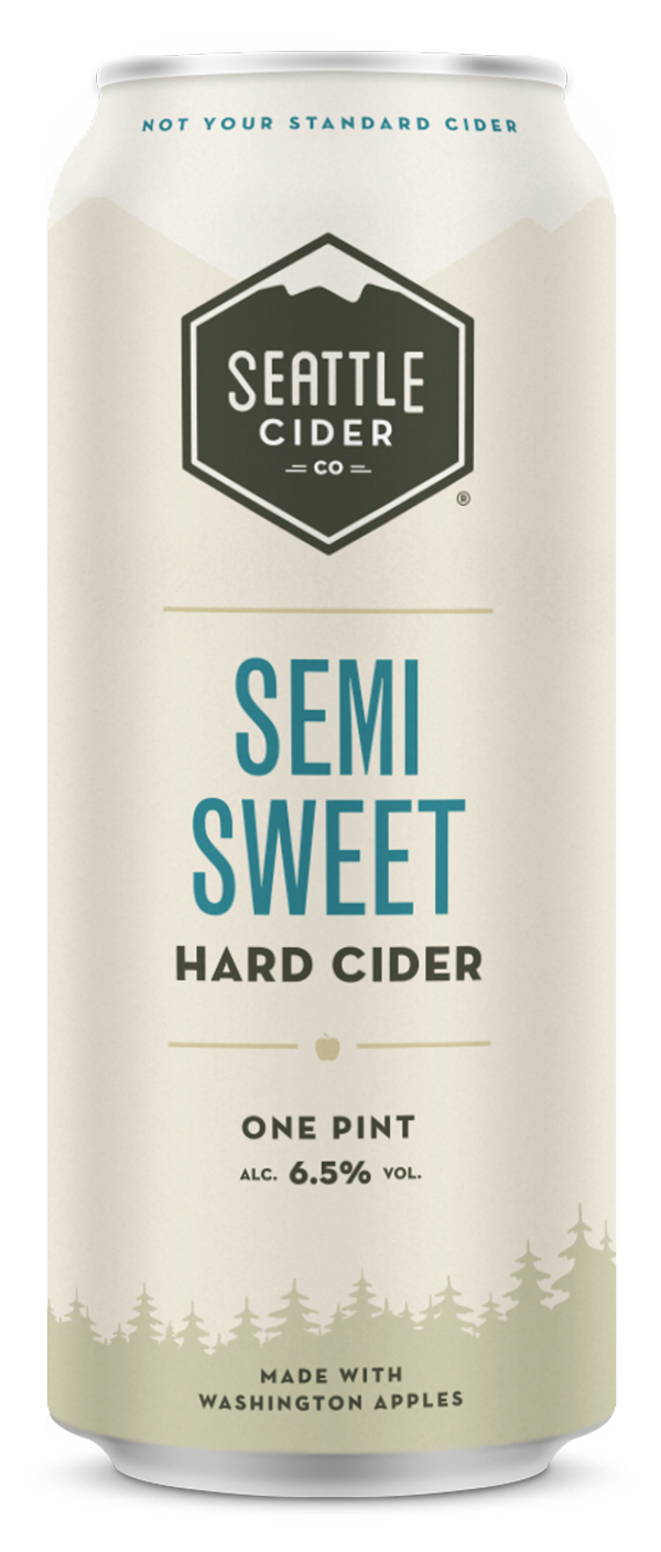
Year-Round — photo: Seattle Cider Company
"I wanted to create something that felt like the cool, refreshing part of the evening after a warm day in Washington State's Cascade Mountains."
Written Proposal
I began my process by sketching out a lot of ideas. My top three ideas were the use of a topographic map (which fits within their outdoor theme), organic illustrations with honey and peaches, and then something using more geometric shapes. I then took my concepts to our group critique for some feedback. After presenting my solutions, my critique group said that the ideas felt too disassociated with the brand. I went back and began exploring and altering the existing brand elements to finding ways to incorporate them into a cohesive design.
I then took my concepts into Adobe Illustrator and some digital sketches based on my mood board. I wanted to create something that felt like the cool, refreshing part of the evening after a warm day in Washington State’s Cascade Mountains. I recreated some of the shapes that existed with the brand and based it around the Seattle Cider Co. logo. Inspired by the designer, Saul Bass, I wanted to create something using silhouettes while incorporating gradients and geometric patterns.
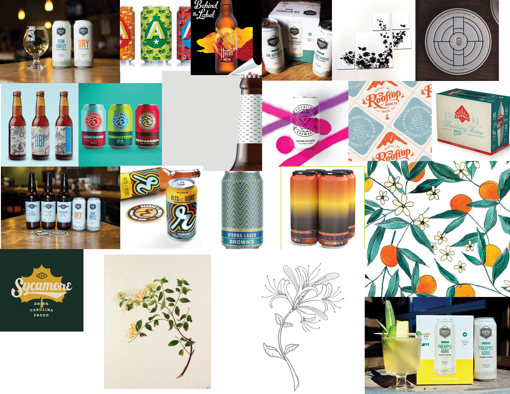
Moodboard
MADE FROM SCRATCH
Visual Direction
I refined my color palette to reflect the feeling and look of a cool evening after a warm summer day in the Cascades. I decided to stick with the brand’s typography — Good Pro Condensed & Neutra Text.
4-Pack Carrier
While Seattle Cider Company generously provided me the dieline for their 4-pack carrier, it did not have the locations marked for where the copy or other graphic elements went, such as the legal copy, logo and primary copy, nutritional facts, etc. This required me to rip apart an existing cardboard carrier myself and measure every detail, including the height of the typography and graphic elements in relation to the edges. This took a generous amount of scrupulous detail, organization, and time to get right. Once I established the general layout, I was then able to recreate some of the graphic elements and put in place the typography. At this point, I was able to play around with the visual design and color palette.
Blank Dieline
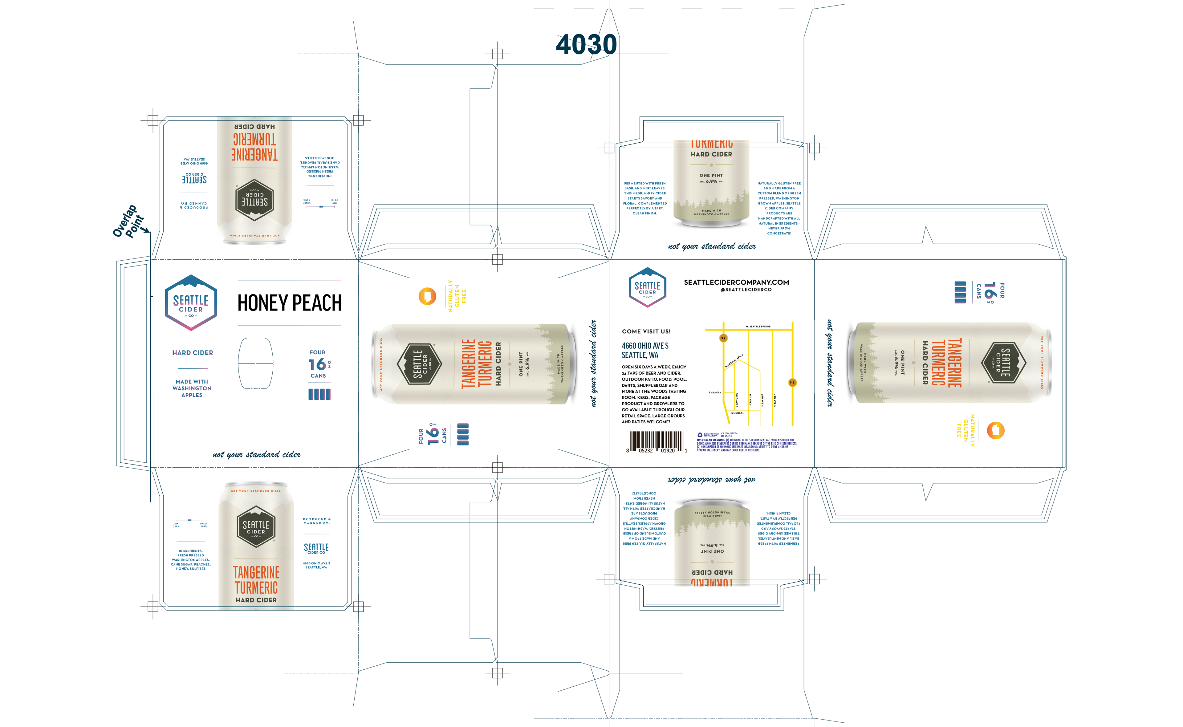
Version 1
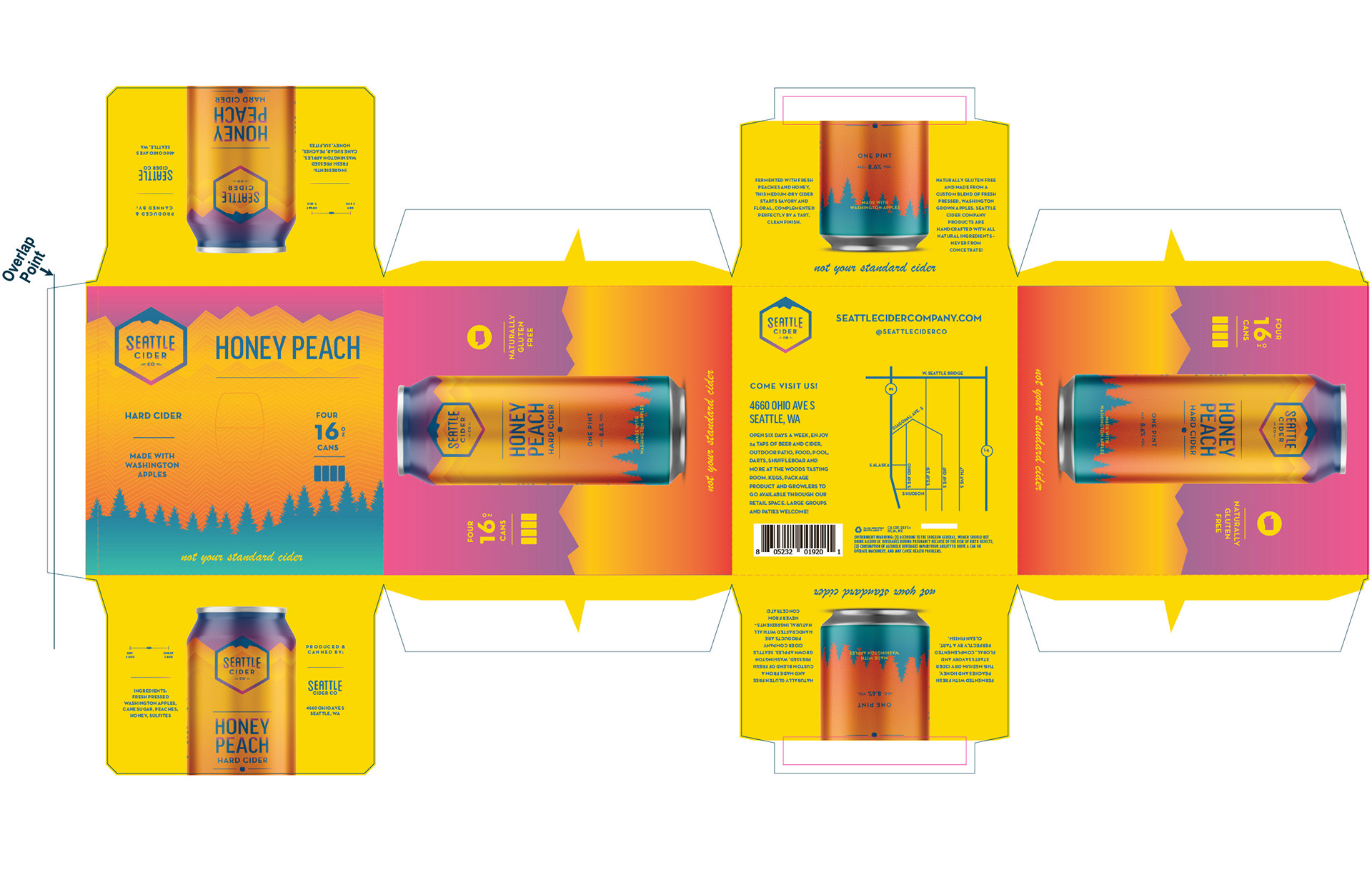
Final Carrier
Can
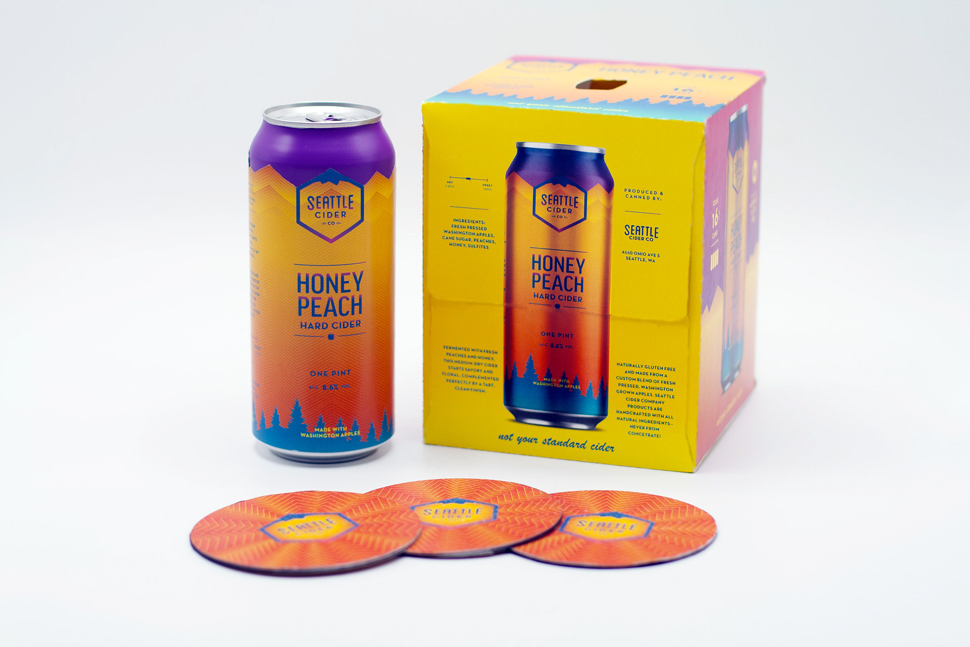
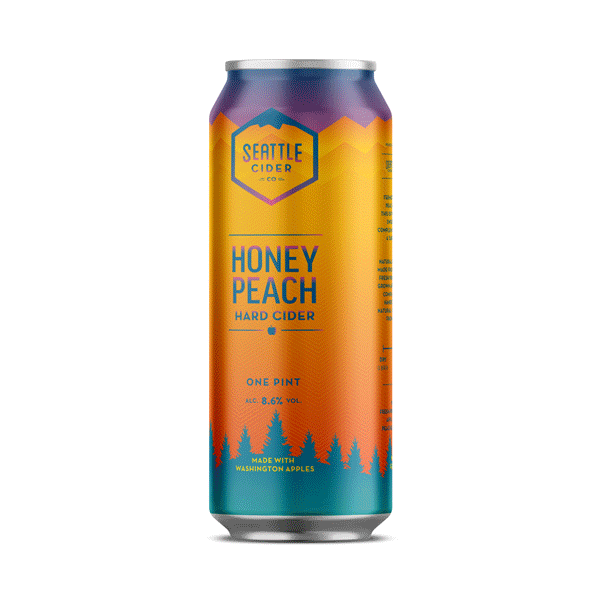
I had the good fortune working in a classroom with a few other folks who were designing their packaging for Seattle Cider Company. They had already torn apart the can and gave me the dimensions. I returned the favor with the cardboard carrier. After creating a new document in Illustrator, place rectangular guides in a new layer and began putting my graphic elements and copy. The goal here was to maintain consistency with Seattle Cider Company’s brand guidelines — making it recognizable on the shelf to existing consumers. At this point, I began translating the graphic elements that I made in the cardboard carrier to fit the can while playing with a little bit of color and gradients. I continued down the color and gradient rabbit hole. I felt like the mountain color in version 2 was a little too flat, bland, and dark. Thinking of the brief moments of mountain alpenglow and warm summer nights, I created a gradient in the mountains and repeated the pattern to create a sense of depth. Looking at my moodboard, I wanted to add a little bit of texture to the design to make it feel exclusive and unique. So, I took the outline of the mountain and repeated that pattern on the can.
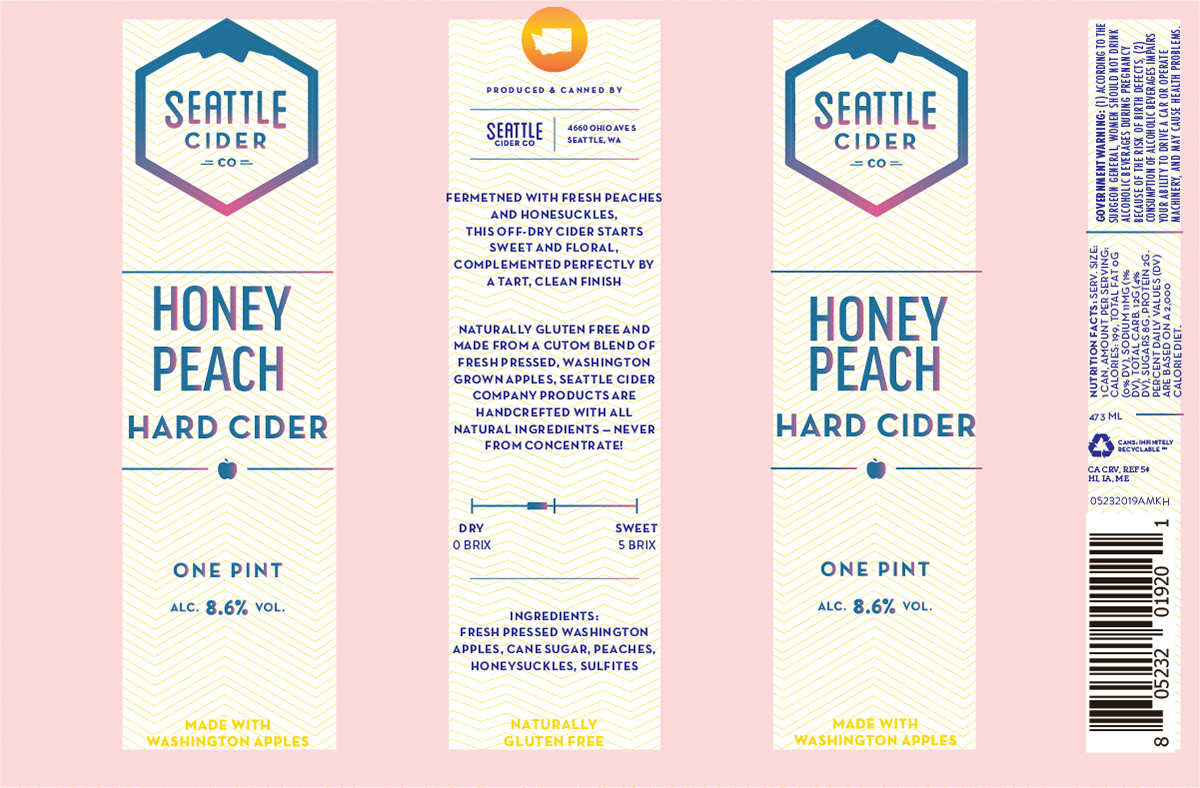
Version 1 — Type Layout
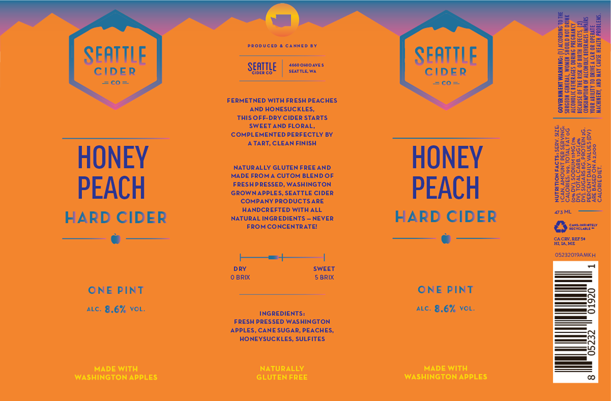
Version 2 — Graphic Elements and Color
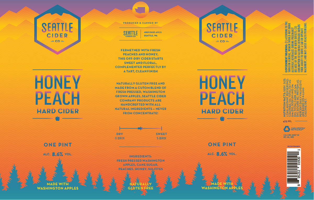
Final Can Design
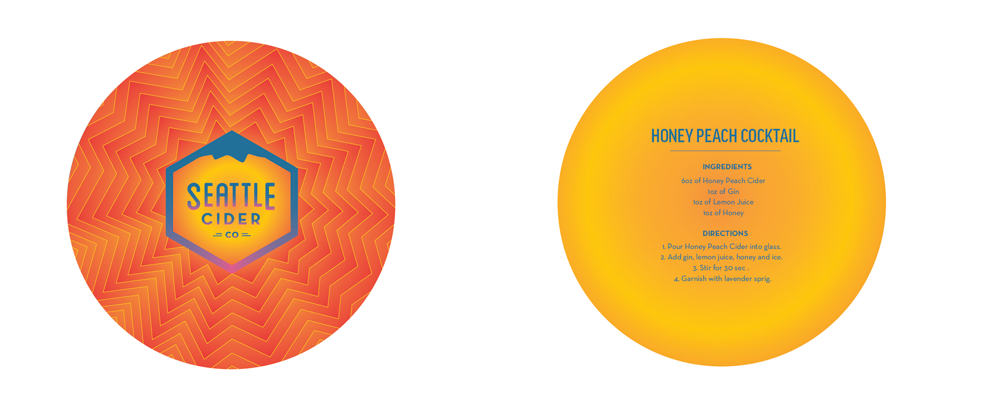
Coaster
While Seattle Cider Company has a tasting room in Sodo (South Seattle), they distribute their cider to bars and restaurants all across the Puget Sound. So, I wanted to create something consumers could take home with them and hang on to after visiting one of these locations. I took the same design from the can and carrier and translated it into a round coaster, repeating the gradient on the front and back. I then created a cocktail recipe using the Honey Peach cider — prompting the consumer to buy the cider from the shelf and make a delicious concoction for themselves and friends during the warm summer evenings.
______________________________________________________________
SUMMARY
In conclusion, I believe the limited edition, honey peach cider design was a success. It stands apart from Seattle Cider Company’s year-round ciders while still being recognizable to the consumer and working within the brand’s guidelines. The warm palette and use of gradients evoke feelings of summer, captures the flavor profile of the beverage, and feels cohesive between the can, 4-pack carrier, and coaster. If I were to continue this project, I would like to expand it to the other three seasons and limited-release flavors.