PROBLEM
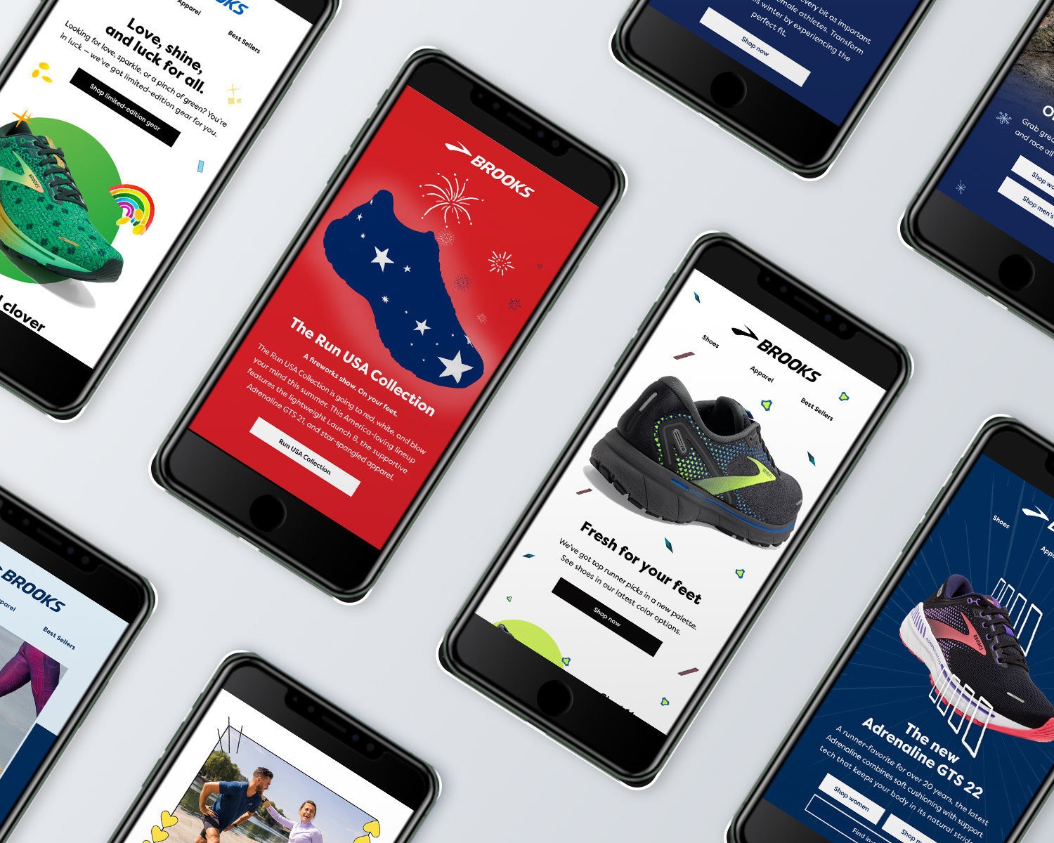
Build a cohesive and responsive brooksrunning.com homepage that features the new Glycerin 19 GTS and promotes the Pixel Pack campaign, new editorial content, while providing an exit path for the user.
SOLUTION
• Leverage creative assets for various campaigns in order to encourage click throughs and drive sales
• Build out individual assets while maintaining a cohesive look and feel throughout entire home page
• Build out individual assets to spec for quick page load time
Timeline 5 weeks
Category Web Design, Layout, Animation
Tools Sketch, Photoshop, Acrobat
______________________________________________________________
PROCESS
Kickoff
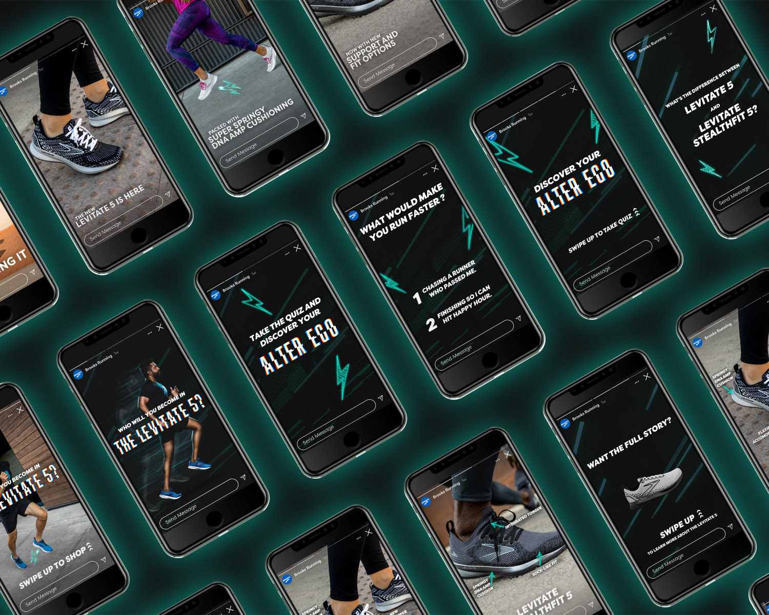
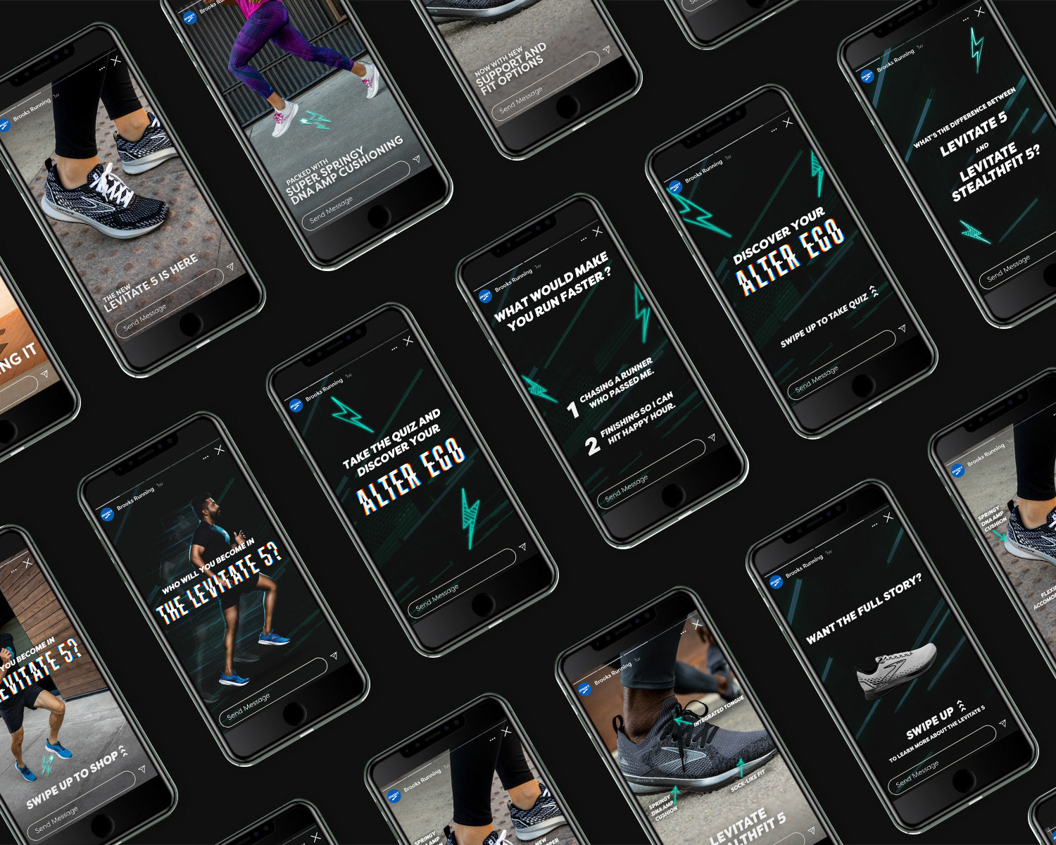
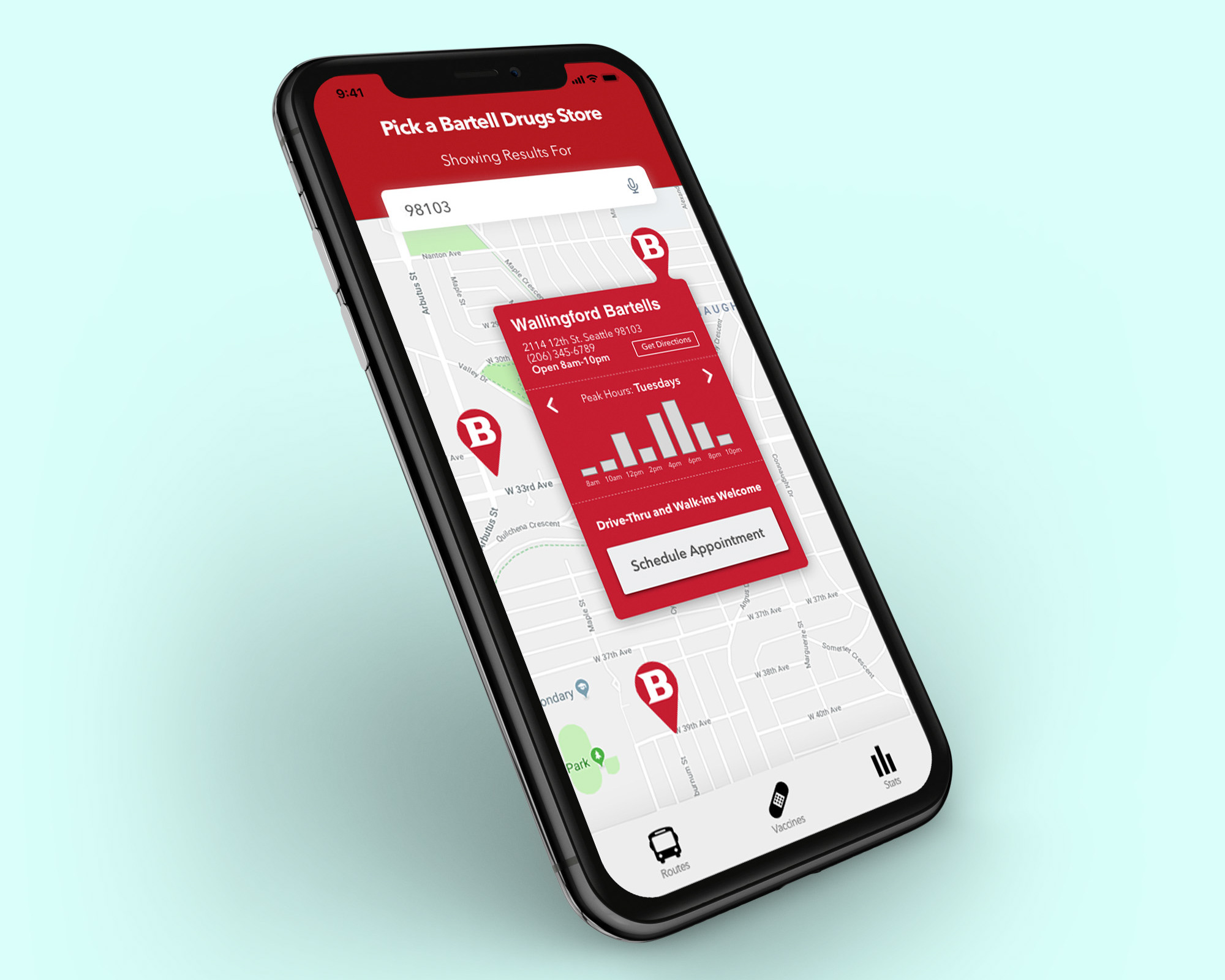
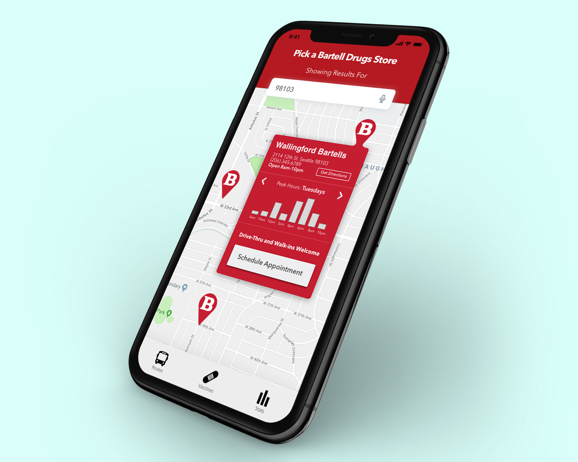
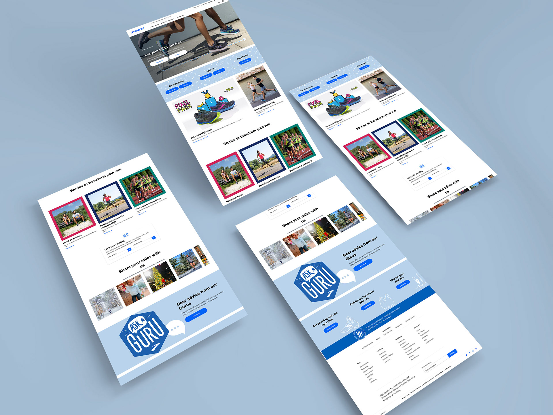
Every project begins with a kickoff meeting with the designers, copy writers, project manager and site publisher. This allows us the opportunity to ask questions about the project at hand. For this project I was tasked with building three homepages — one default and one SEO page for the United States market and one default page for the Canadian market all in mobile, tablet, and desktop size. For the sake of brevity I will focus on the default page I built for the US market.
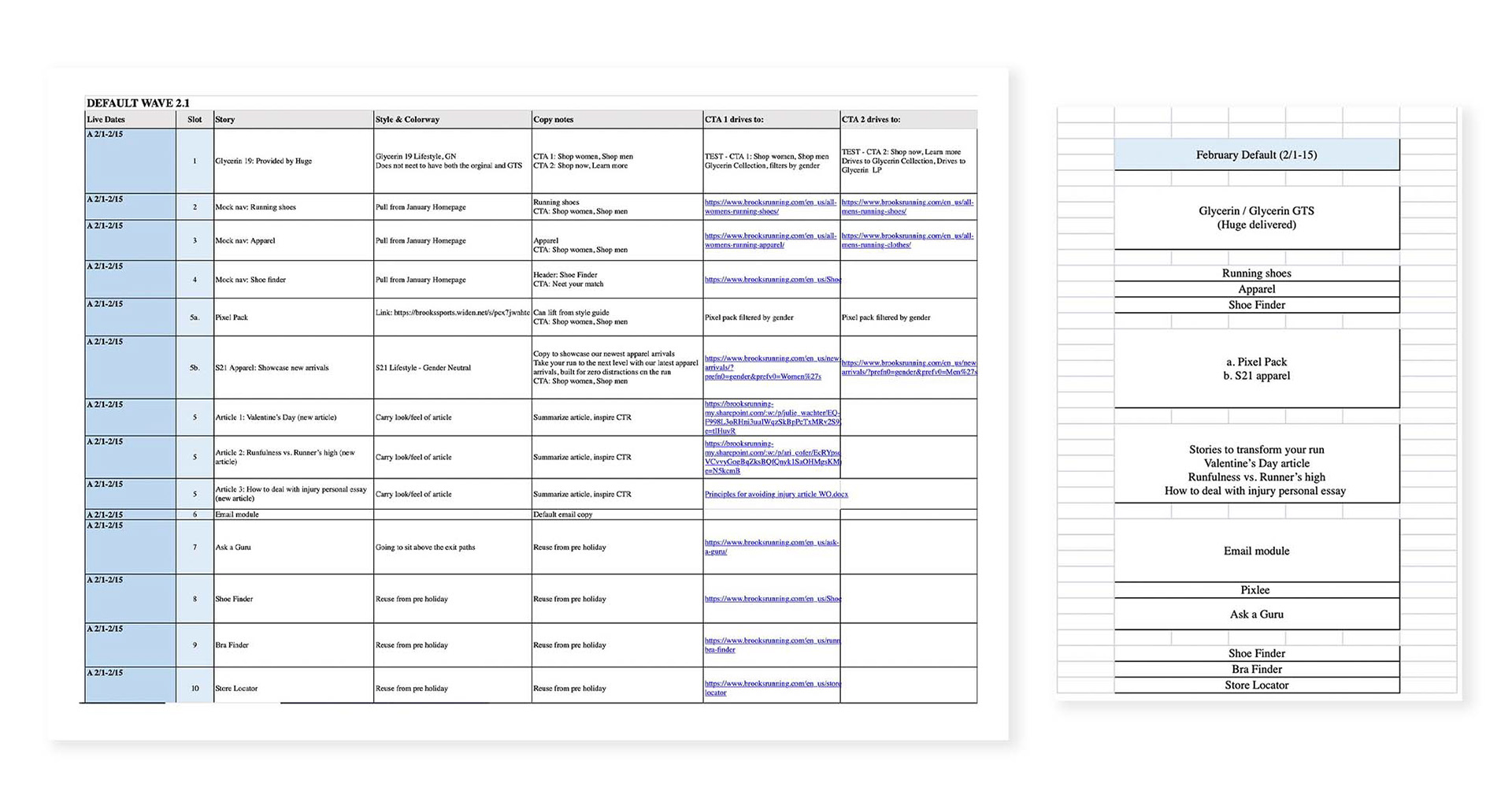
List of deliverables, notes, and links for the 2.1 Homepage
This being my first homepage design, I felt overwhelmed and a little confused at the task at hand. There were many deliverables and I was still in the process of dialing in my workflow and familiarizing myself with all of the components built out in Sketch. During times like these I like spending a little extra time getting myself organized by building out my folders, kanban board, filling out my calendars with due dates and envisioning the start to finish process. I find that doing this saves myself a lot of time and confusion in the end. In this process I will sometimes step away from my computer and sketch out a wireframe by hand. This tactile process helps me gain a firm understanding of what it is that I'm building.
Workflow
One of the many reasons I enjoy working for Brooks Running is their focus on design systems. While many designers and artists may find this limiting I find it freeing. This guarantees there is a consistent Brooks look and feel across all channels and customer touch points. I find creative restraints not only push me as a designer but, ironically, gives me more freedom as a designer while making expectations and communication much easier with my colleagues. With that said, we have pre-built components in Sketch that make the wire-framing to final mockup process easier with rules for type, color usage, image size and weight, and much more clearly defined in our brand guidelines. This foundation makes communication and expectations much easier.
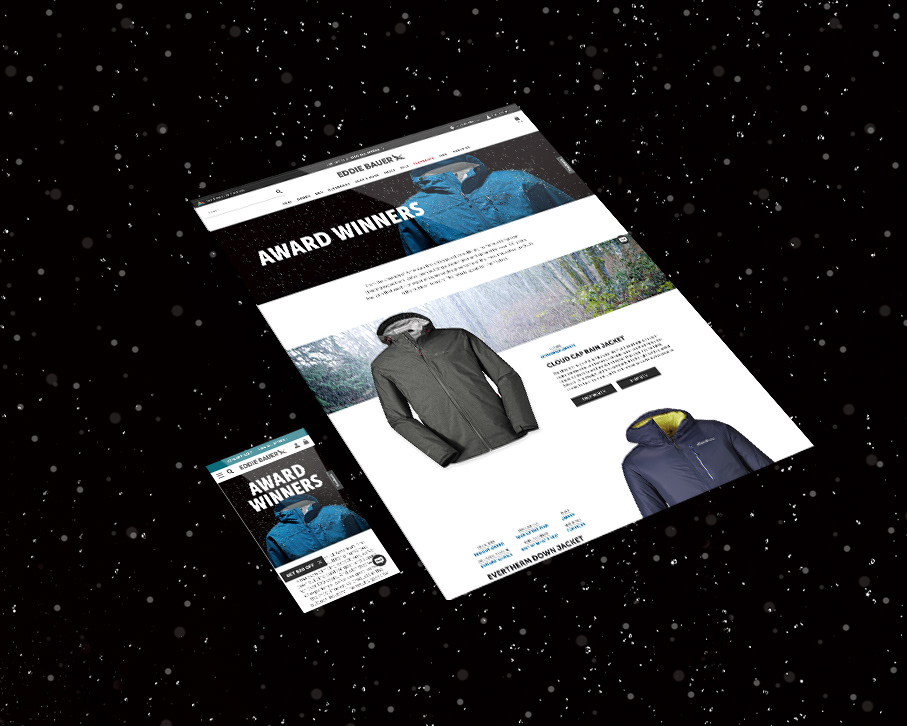
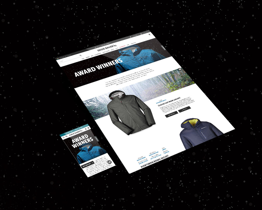
After sketching out wireframes by hand and downloading assets I then begin building out the wireframe in Sketch by pulling from the pre-built components in the Library for all viewport sizes. While referencing the Brooks brand guidelines I begin building out my Photoshop artboards with the correct naming convention, allowing for quick and easy exporting and organization.
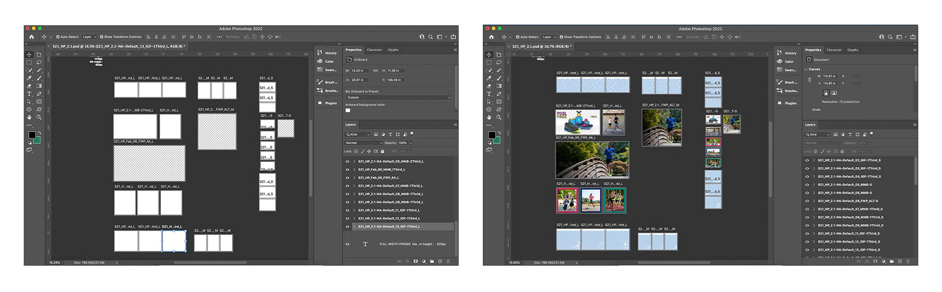
Photoshop artboards guarantee a clean workflow
Plug and play
After the tedious, but somewhat enjoyable process of organization, it's time to begin plugging and playing. The copywriter sends me their document I'll read over everything and begin the command-c, comand-v process into Sketch. I'll drop photos into Photoshop, resize and then export into a designated folder before placing the exported photos into Sketch. There are times where the copy laying on top of the image doesn't work well. This could be an issue of copy-image contrast or copy covering the main subject. I'll then go back into Photoshop, make adjustments to the photo as needed, re-export, and place back into Sktech. While this process can seem very tedious to some it helps me maintain and clean workflow.
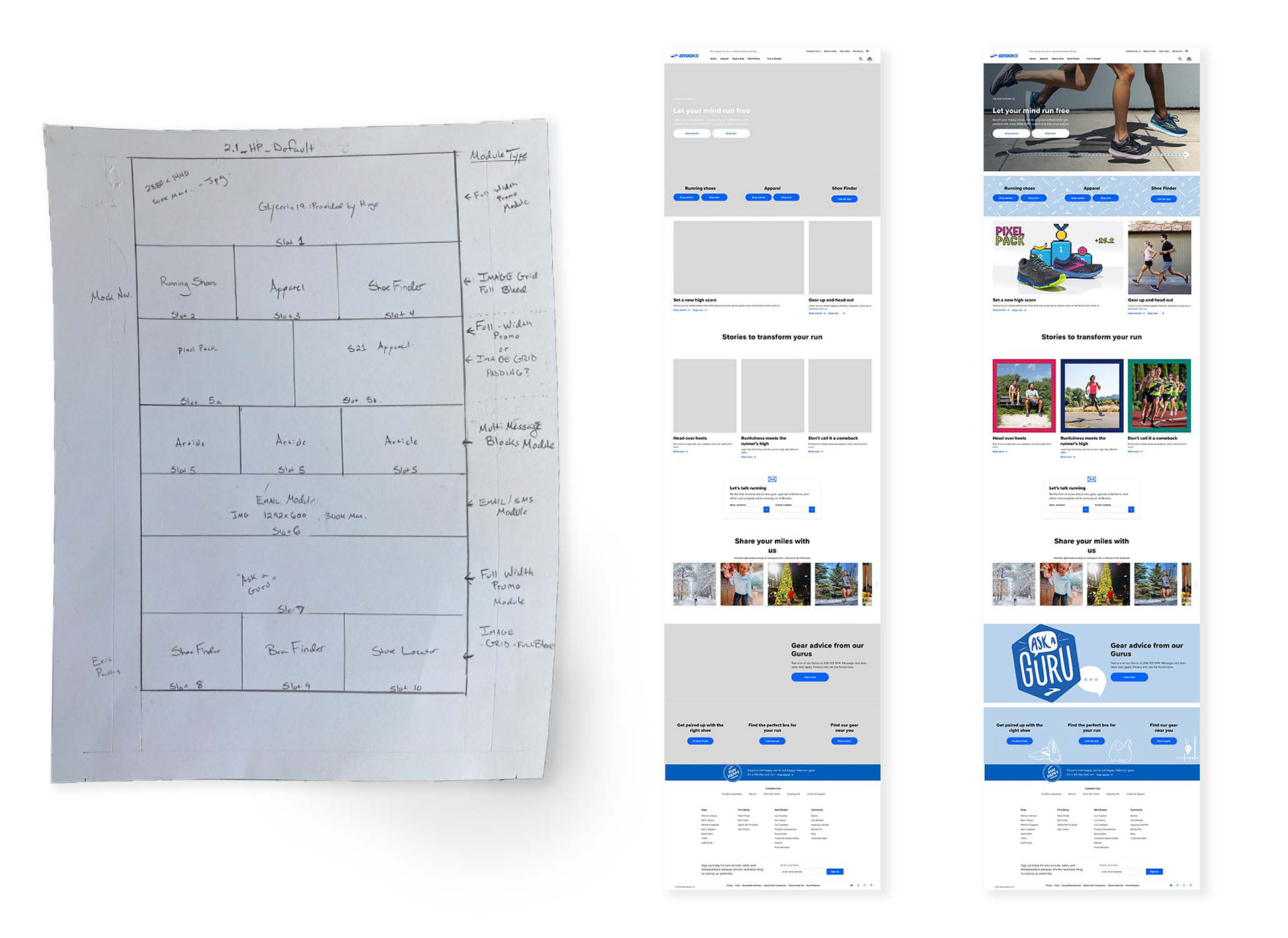
Hand-drawn wireframe to mid-fi wireframe to the final mockup
Problem solving
The main story we wanted to feature was the new Glycerin 19. This campaign had been created by an outside agency and the hero's animated GIF had already been approved by the stakeholders. The final assets had been delivered to me but the way the runner's legs appeared in the mobile hero looked as if they were just there not attached to anyone's body. This required me to go back into the working Photoshop to scale down the runners so that it looked more like the tablet and desktop versions and essentially recreate the GIF by using Photoshop's timeline feature and masking out the moving arrow in each frame.
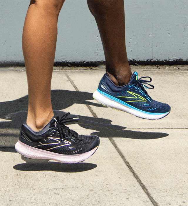
Original GIF
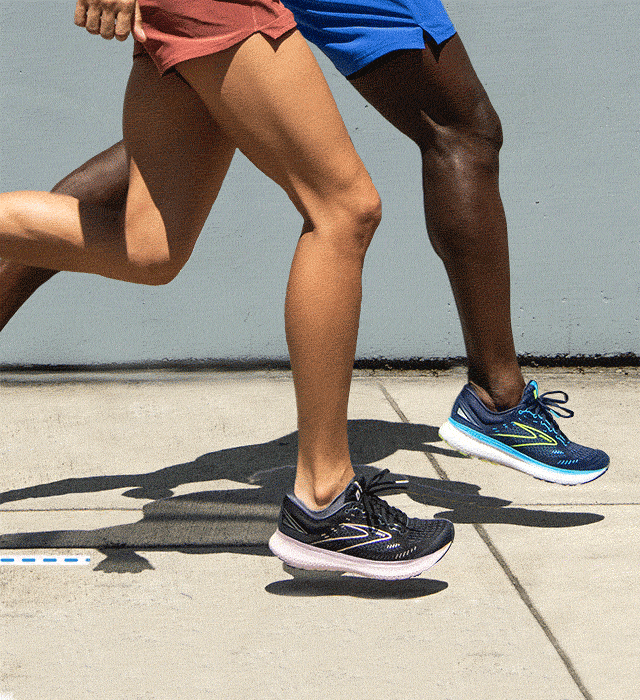
Re-designed GIF
Review
Each project goes through a review process. Once a hi-fi mockup is completed, I compile my work into a PDF and share out with my manager and copy-writer to make sure the copy works with the images and everything has been translated to the design correctly. It's always nice to have someone else look at your design because while staring the screen for long periods of time causes one to overlook little details such as stray white pixels in the corner of an image or mis-alignment on components, etc. Often times, minor updates need to be made and once things have been approved the project manager then shares out the document with stakeholders.
The stakeholders involve individuals on the editorial content team, digital content specialist team, as well as everyone else who was involved in the internal review. During this process, reviewers go over the layout with a fine-toothed comb, making sure the design is what they envisioned and the components work with the links they are paired to. I enjoy explaining my reasoning and design during stakeholder reviews. Minor updates are often times requested. Once these are made they get sent back out to stakeholders for final approval before being uploaded to Brooks' server for site-publishers to retrieve and build.
______________________________________________________________
SUMMARY
This was my first homepage build and things, at the start, felt rather overwhelming. They say to really understand the way something works you have to get in the weeds..I was unfamiliar with many of the components and still a little unsure how I was to approach and execute each deliverable efficiently. But like any other project I've ever worked on I broke things down into bite-sized chunks and diligently worked my way over each hurdle. I built out wireframes, flowed in copy, resized media, kept my files and workflow organized. There were minor suggestions and made during the reviews such as re-positioning some illustrative elements and utilizing new media. After the final review with stakeholders I uploaded my final files and communicated with site publishers to QA the live preview across mobile, tablet, and desktop breakpoints to guarantee it looked how it did in the mockup. This project was a great learning experience and I look forward to designing many more.