PROBLEM
• Conceptualize, design, and build a responsive and cohesive Awards Landing Page for the Eddie Bauer website.
• Design badge lockups for multiple awards
SOLUTION
• Set timeline for list of deliverables for each stage of the project
• Work with Public Relations Team to gather products and awards list
• Audit brands’ awards pages
• Research awards lockups, sketch and work through multiple iterations.
• Work alongside copywriter & other designers for brainstorming and creative feedback
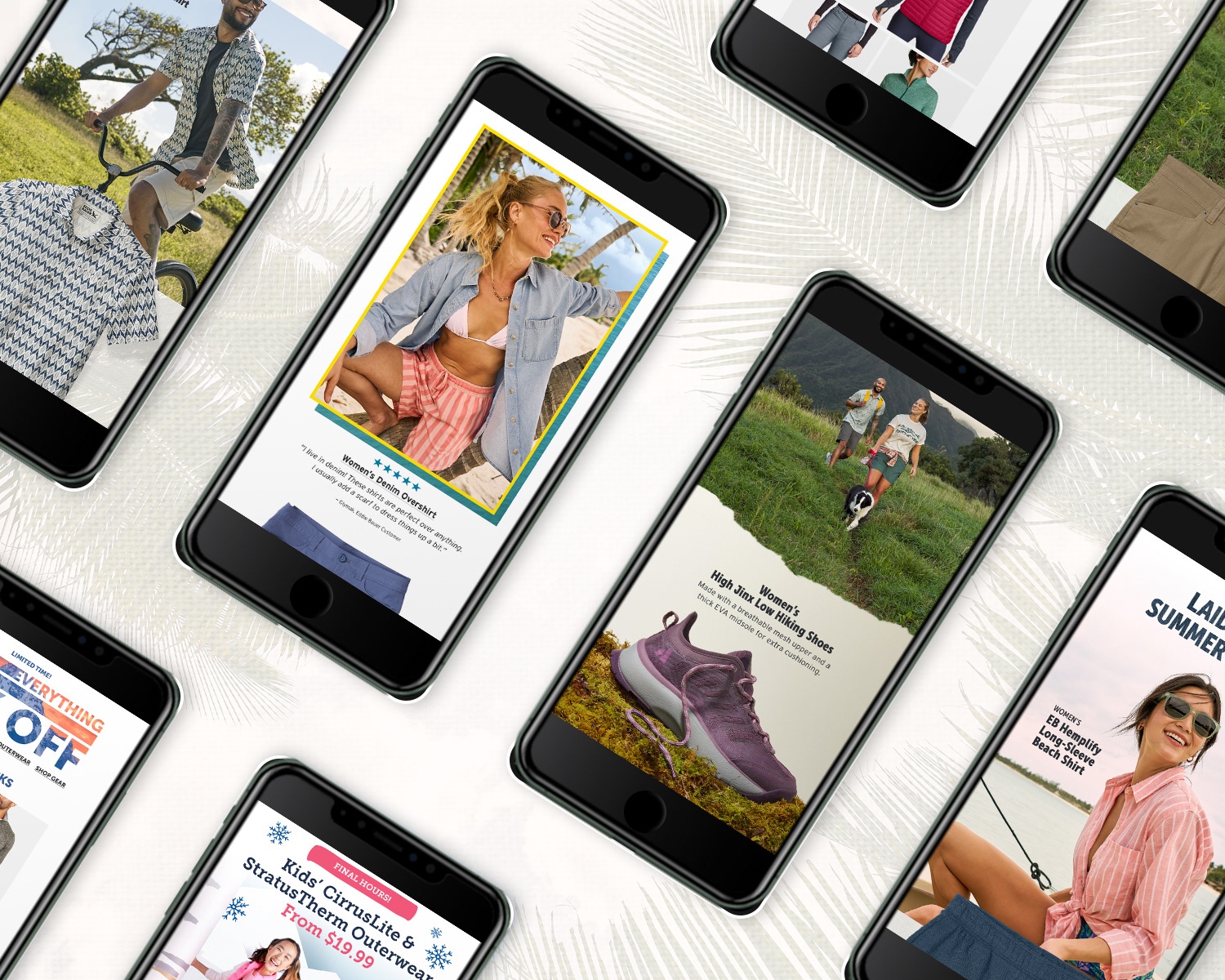
• Work between Photoshop & Figma to design mobile-first layout before expanding project to desktop.
• Export assets into digital asset management system and build out responsive landing page in Content Management System
• Work between Photoshop & Figma to design mobile-first layout before expanding project to desktop.
• Export assets into digital asset management system and build out responsive landing page in Content Management System
Timeline 8 weeks
Category Web Design, Layout, Wordmark Design
Tools Figma, Photoshop, Illustrator, Bloomreach Content Management System
______________________________________________________________
PROCESS
Kickoff
The project started out with a kickoff meeting between the Public Relations Manager, my Art Director, and the Creative Director where we discussed the scope & timeline of the project. It had been about four years since the page was updated so new products and awards needed to be added and it needed an overall refresh.
We also needed to renew our contract with the publications that had awarded Eddie Bauer’s products but since we didn’t have a budget for this I would need to design 30 wordmark lockups for the 19 products we’d be featuring on this page. This being a rather large undertaking we set a timeline for 8 weeks which would allow me to complete this project alongside my other daily tasks.
Wordmark Design
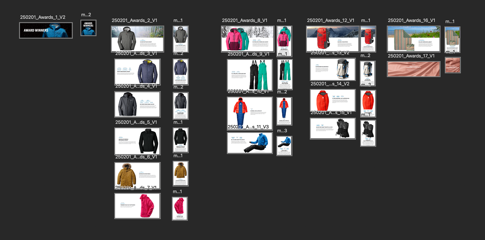
Due to financial constraints we were unable to use the actual badges awared to us by the various publications. There were a total of 30 unique awards for 19 products. The awards needed to be cohesive and on-brand. There being 30 different awards, each with a different amount of characters, created a unique challenge when thinking how they would be grouped together.
My first step in the process was to create a mood-board with lockups that I found appealing and felt like that could work for our brand. From there I began sketching out about 40+ of these ideas in Illustrator before getting some initial proof-of-concept feedback. I then threw out some of the bad concepts and kept the good ones and whittled down and refined seven concepts to share with my Creative & Art Director.
After multiple reviews and discussions we opted for something that was stacked as this felt like it had more of an impact, would be scalable to the other awards and would nest nicely together when on the page. Wordmarks are technically not logos. I found this out after I reached out to our UX designer to make sure that my designs were ADA compliant. This little curve ball required me to go back and adjust the size of the publication copy above the award title.
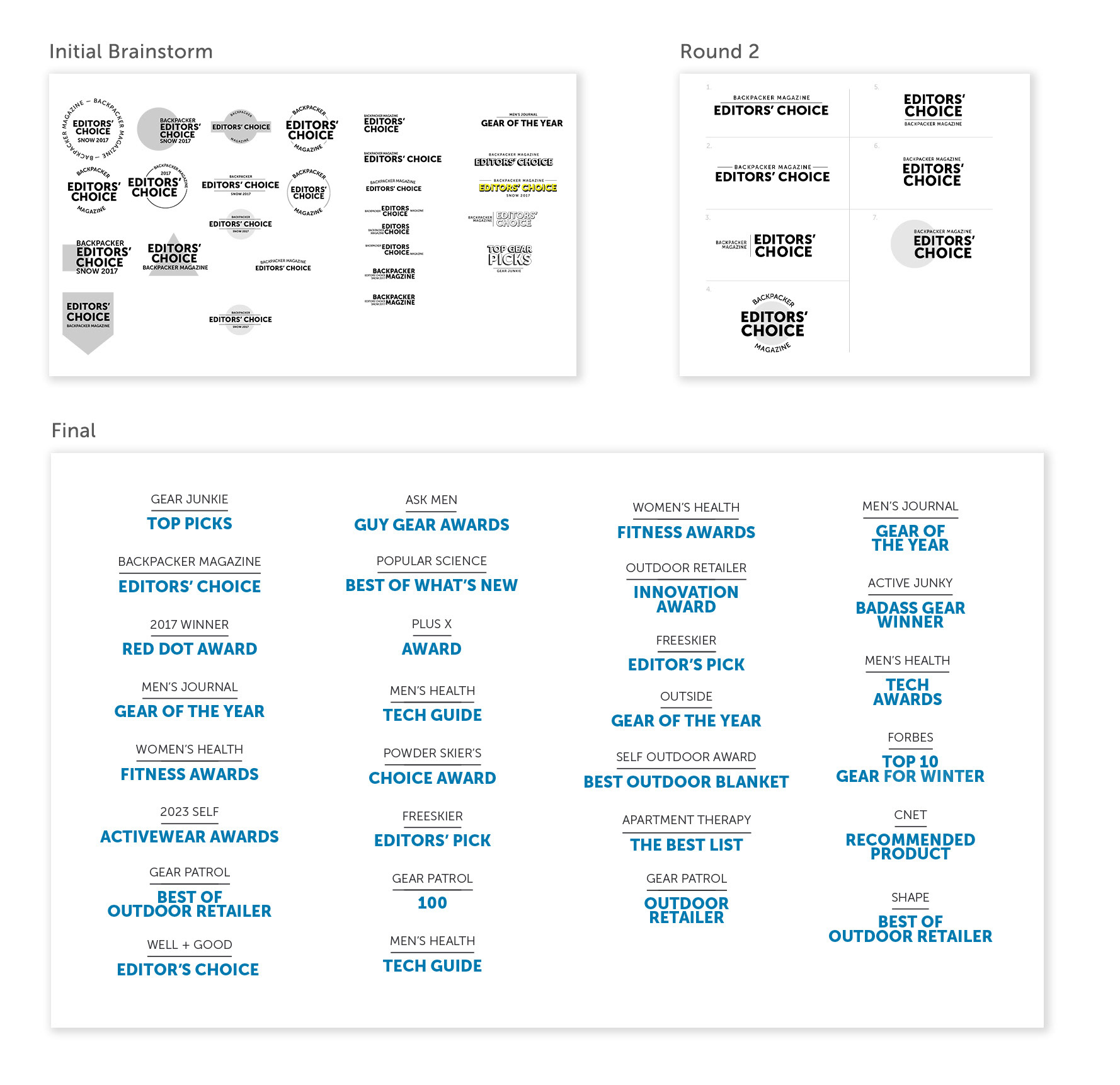
After compiling a list of the 19 products and the associated awards I decided to break this project into four categories: outerwear, ski-wear, gear, & home. This would provide a nice opportunity to create some visual break on the page while grounding the products and setting the mood for the products.
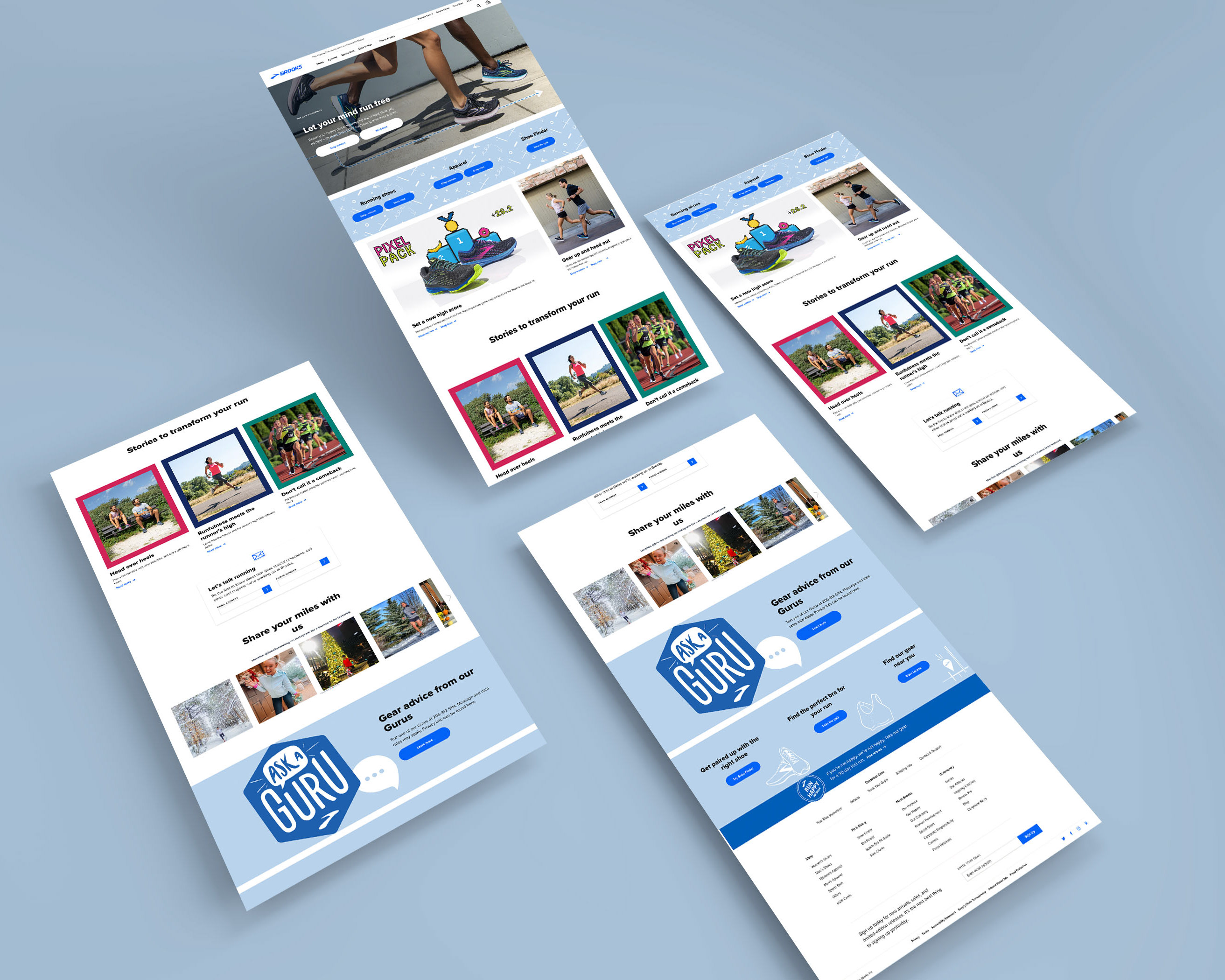
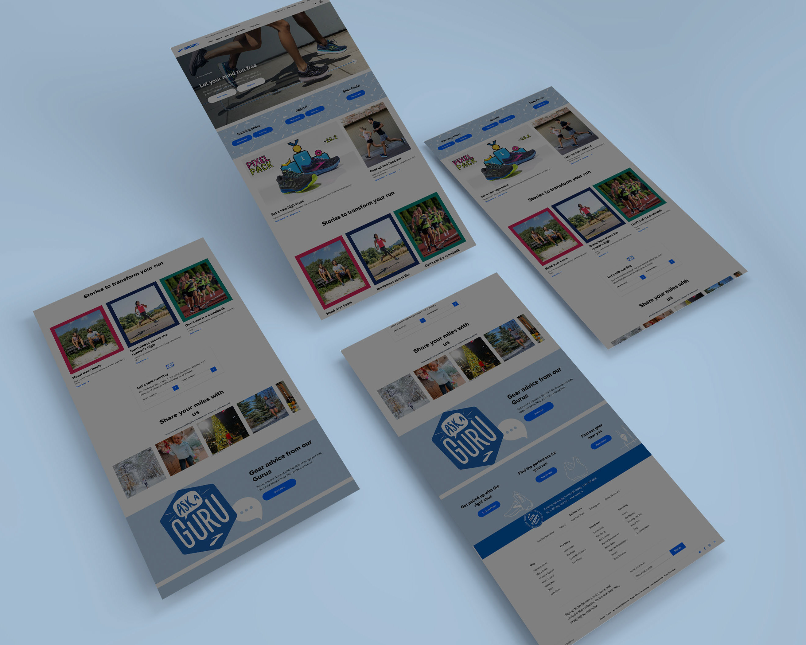
Wireframe & Design
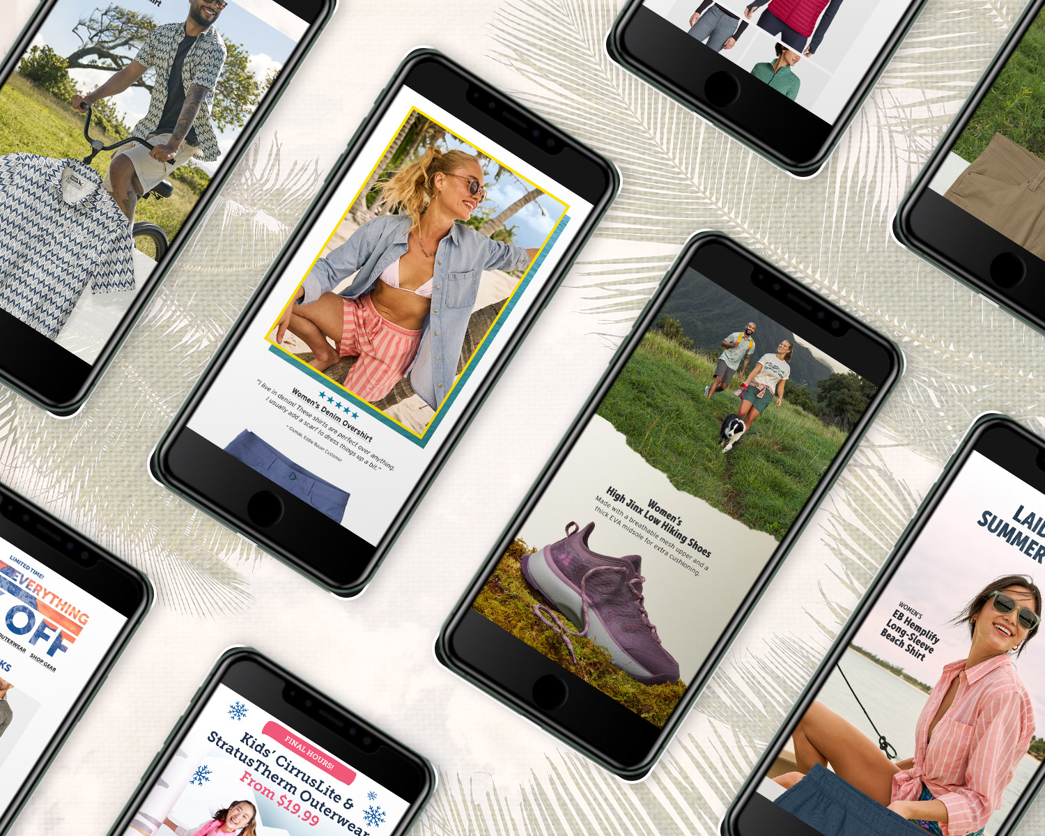
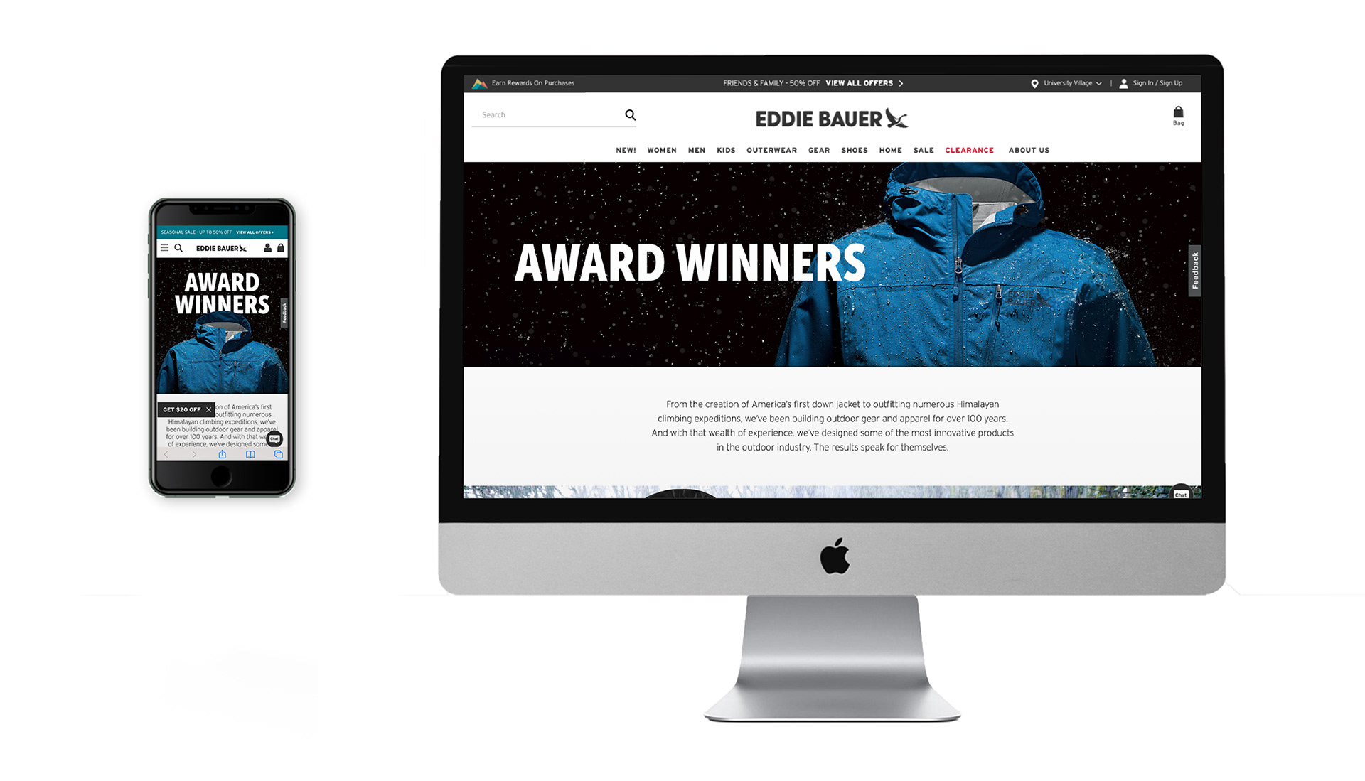
While auditing and researching other companies I created a moodboard, trying to capture an aestheic that I felt would be on-brand for Eddie Bauer. I took these concepts into Figma laying out a series of lo-fidelity wireframes. Taking these concepts to my manager we worked through some of options before coming up with an idea we felt fit best with the brand and the photography we had available to us. I then took this wireframe and began including location photography, product laydowns, copy, and wordmarks.
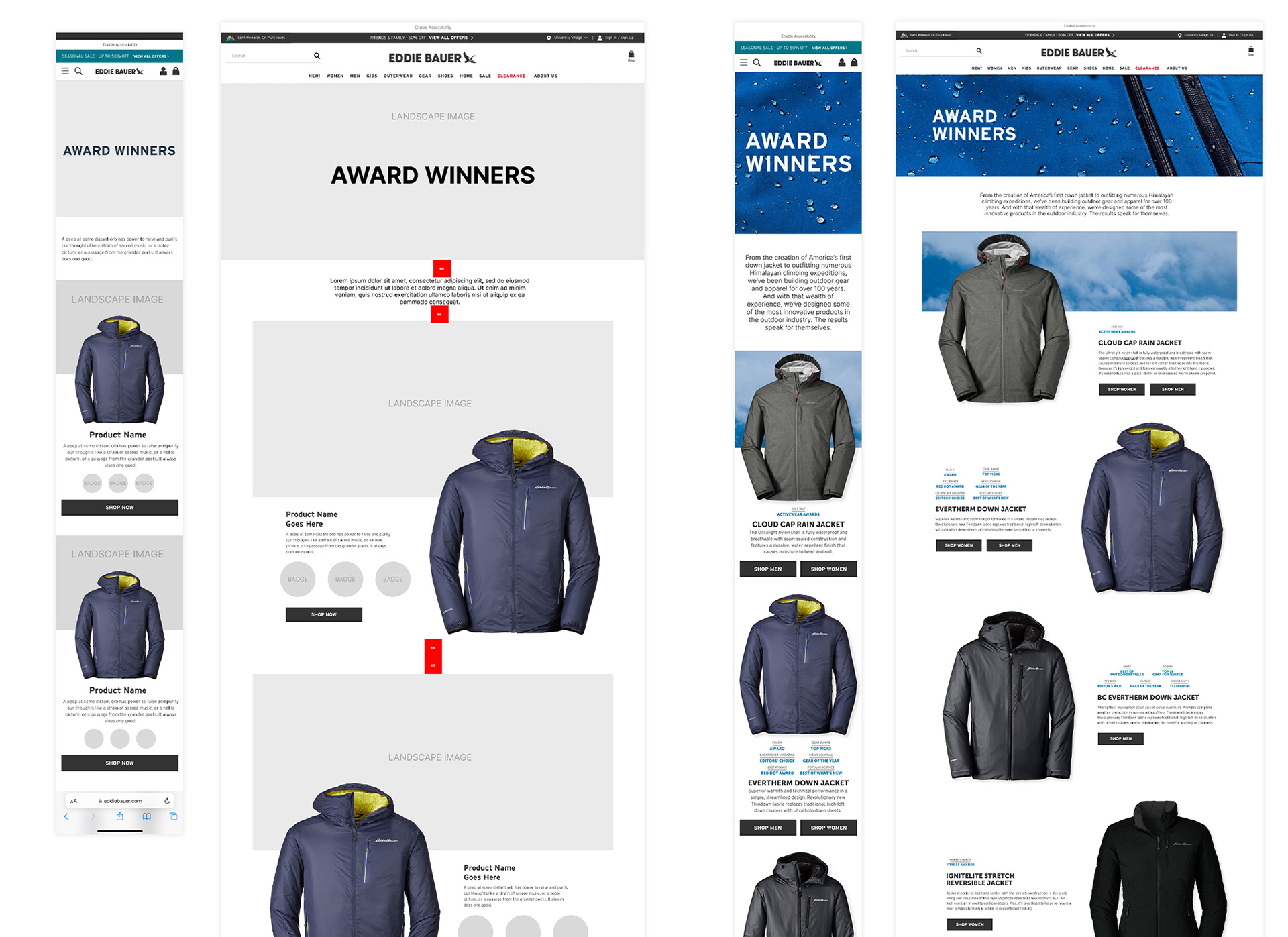
Figma Wireframe — Lo-Fidelity to Mid-Fidelity
After building a complete lo-fi wireframe in Figma I began collecting all the digital assets and designing in Photoshop. Setting up my artboards at 2x the size: 780px for mobile layout built at 390px and 2880px for desktop designed at 1440px. This would guarantee consistent spacing, wordmark and type size when adding final comps to our CMS.
I organized the page into sections — outerwear, winter-wear, gear & accessories, and home products. Each section feature a full-width banner that would set expectation of products to follow. Once designed, I exported my files, placed the comps in Figma for a mockup before sending out for review.
I organized the page into sections — outerwear, winter-wear, gear & accessories, and home products. Each section feature a full-width banner that would set expectation of products to follow. Once designed, I exported my files, placed the comps in Figma for a mockup before sending out for review.
Bloomreach CMS
Exporting files to our digital asset manager and building out a test page in our content management system, Bloomreach, was the next step in process to make sure everything was behaving as it should. Here, I would make other minor tweaks to to my photoshop file, adjust the height of the module and CTA positions within the composition